Appearance
帧动画
基础知识
通过定义一段动画中的关键点、关键状态来创建动画。Keyframes 相比 transition 对动画过程和细节有更强的控制。
过渡动画是两个状态间的变化,帧动画可以处理动画过程中不同时间的细节变化,不过对过渡动画理解后再不习帧动画会非常容易,也可以把帧动画理解为多个帧之间的过渡动画。
关键帧
使用@keyframes 规则配置动画中的各个帧
- from 表示起始点
- to 表示终点
- 可以使用百分数如 20%动画运行到 20%时间时
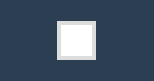
基本使用
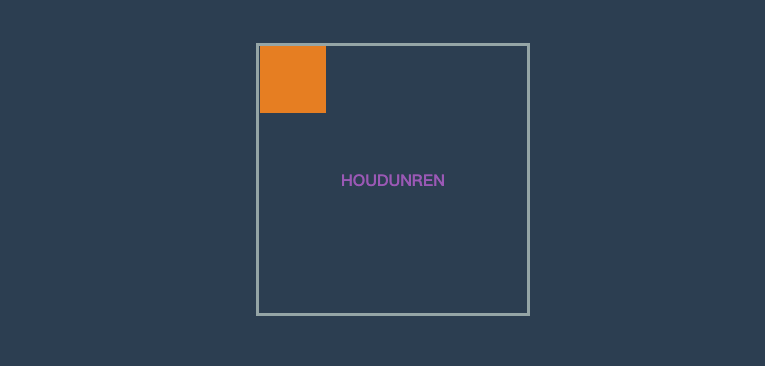
下面使用 @keyframes 定义了动画叫 hd 并配置了两个帧动作from/to ,然后在 div 元素中使用animation-name 引用了动画并使用animation-duration声明执行三秒。
- 动画命名不要使用 CSS 关键字如
none
<style>
    * {
        padding: 0;
        margin: 0;
    }

    body {
        background: #2c3e50;
        display: flex;
        flex-direction: column;
        justify-content: center;
        align-items: center;
        box-sizing: border-box;
        width: 100vw;
        height: 100vh;
        padding: 80px;
    }

    main {
        width: 400px;
        height: 400px;
    }

    div {
        width: 150px;
        height: 150px;
        background-color: #fff;
        border: solid 20px #ddd;
        animation-name: hd;
        animation-duration: 3s;
    }

    @keyframes hd {
        from {
            opacity: 0;
            transform: scale(.1);
        }

        to {
            opacity: 1;
        }
    }
</style>

<main>
	<div></div>
</main>
时间点
帧动画需要定义在不同时间执行的动作,开始与结束可以使用 form/to 或 0%/100% 声明。
- 必须添加百分号,25%是正确写法
- 时间点没有顺序要求,即 100%写在 25%前也可以
- 未设置
0%与100%时将使用元素原始状态
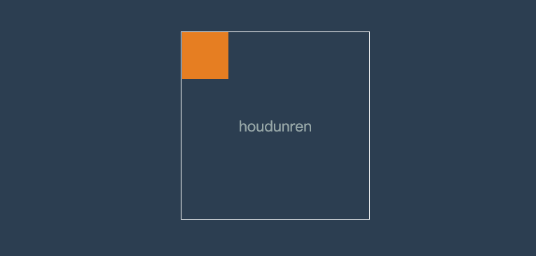
物体移动
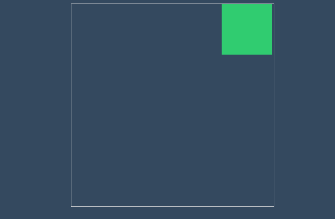
下面定义不同时间点来让物体元素移动一圈,下例中可以不设置from/to 系统将定义为元素初始状态。

<style>
    * {
        padding: 0;
        margin: 0;
    }

    body {
        background: #2c3e50;
        display: flex;
        flex-direction: column;
        justify-content: center;
        align-items: center;
        box-sizing: border-box;
        width: 100vw;
        height: 100vh;
        padding: 80px;
    }

    main {
        width: 400px;
        height: 400px;
        border: solid 2px white;
    }

    div {
        width: 100px;
        height: 100px;
        background-color: #e67e22;
        animation-name: hd;
        animation-duration: 3s;
    }

    @keyframes hd {
        0% {}

        25% {
            transform: translateX(300%);
        }

        50% {
            transform: translate(300%, 300%);
        }

        75% {
            transform: translate(0, 300%);
        }

        to {}
    }
</style>

<main>
	<div></div>
</main>
同时声明
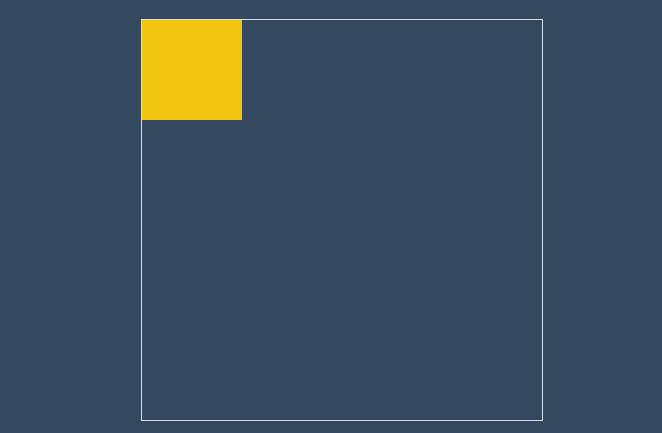
时间点可以动画样式一样时可以一起声明,下面将 25%/75%背景一起声明。
<style>
    * {
        padding: 0;
        margin: 0;
    }

    body {
        background: #2c3e50;
        display: flex;
        flex-direction: column;
        justify-content: center;
        align-items: center;
        box-sizing: border-box;
        width: 100vw;
        height: 100vh;
        padding: 80px;
    }

    main {
        width: 400px;
        height: 400px;
        border: solid 2px white;
    }

    div {
        width: 100px;
        height: 100px;
        background-color: #e67e22;
        animation-name: hd;
        animation-duration: 3s;
    }

    @keyframes hd {
        25% {
            transform: translateX(300%);
        }

        50% {
            transform: translate(300%, 300%);
        }

        75% {
            transform: translate(0, 300%);
        }

        25%,
        75% {
            background: #9b59b6;
            border-radius: 50%;
        }

        50%,
        100% {
            background: #e67e22;
        }
    }
</style>

<main>
	<div></div>
</main>
使用动画
使用 animation-name 规则可以在元素身上同时使用多个动画。
- 使用多个动画时用逗号分隔
- 多个动画有相同属性时,后面动画的属性优先使用
基本使用
<style>
    main {
        width: 400px;
        height: 400px;
        border: solid 5px #95a5a6;
    }

    div {
        width: 100px;
        height: 100px;
        background-color: #e67e22;
        animation-name: hd, scale;
        animation-duration: 3s;
    }

    @keyframes hd {
        25% {
            transform: translateX(300%);
        }

        50% {
            transform: translate(300%, 300%);
        }

        75% {
            transform: translate(0, 300%);
        }

        25%,
        75% {
            background: #9b59b6;
        }

        50%,
        100% {
            background: #e67e22;
        }

    }

    @keyframes scale {
        from {
            border-radius: 0;
        }

        75% {
            border-radius: 50%;
        }

        to {
            border-radius: 0;
        }
    }
</style>

<main>
	<div></div>
</main>
动画时间
使用 animation-duration 可以声明动画播放的时间,即把所有帧执行一遍所需要的时间。
- 可以使用 m 秒,ms 毫秒时间单位
- 可为不同动画单独设置执行时间
- 如果动画数量大于时间数量,将重新从时间列表中计算
炫彩背景
下面实例声明三个动画,使用 animation-duration为每个动画设置不同执行的时间。

<style>
    main {
        background: #34495e;
        animation-name: scale, colors, rotate;
        animation-duration: 1s, 5s, 1s;
        animation-fill-mode: forwards;
    }

    @keyframes scale {
        from {
            width: 0;
            height: 0;
        }

        to {
            width: 100vw;
            height: 100vh;
        }
    }

    @keyframes colors {
        0% {
            background: #e67e22;
        }

        50% {
            background: #34495e;
        }

        100% {
            background: #16a085;
        }
    }

    @keyframes rotate {
        0% {
            transform: rotate(0deg);
        }

        50% {
            transform: rotate(-360deg);
        }

        100% {
            transform: rotate(360deg);
        }
    }
</style>

<body>
    <main></main>
</body>
属性重叠
如果多个帧动画设置了相同的属性,不同浏览器的对待方式略有不同。比如 chrome/edge 最新版本对动画的计算就有变化。
我们先来看代码
<!DOCTYPE html>
<html lang="en">
  <head>
    <meta charset="UTF-8" />
    <meta name="viewport" content="width=device-width, initial-scale=1.0" />
    <title>后盾人</title>
    <style>
      * {
        padding: 0;
        margin: 0;
      }

      body {
        width: 100vw;
        height: 100vh;
        background: #34495e;
        display: flex;
        justify-content: center;
        align-items: center;
      }

      main {
        width: 400px;
        height: 400px;
        border: solid 1px #ddd;
      }

      div {
        width: 100px;
        height: 100px;
        background: #f1c40f;
        animation-name: translate, background;
        animation-duration: 4s, 4s;
      }

      @keyframes translate {
        25% {
          transform: translateX(300px);
        }

        50% {
          transform: translate(300px, 300px);
        }

        75% {
          transform: translateY(300px);
        }
      }

      @keyframes background {
        25% {
          background: #2ecc71;
          transform: translateX(300px);
        }

        50% {
          background: #e67e22;
        }

        75% {
          background: #9b59b6;
        }
      }
    </style>
  </head>

  <body>
    <main>
      <div></div>
    </main>
  </body>
</html>
上面的示例在早期 chrome 与 safari 浏览器效果是相同的。
后面的 background 动画优先级高,4 秒时长的动画都用 background 动画来控制 translate 属性
在最新版本的 chrome/edge 中执行过程将两个帧动画结合处理
- 前 25%帧使用 background 的动画
- 25%帧后综合使用 background 与 translate 动画
所以建议尽量不要在两个动画中控制相同的属性
动画属性
不是所有 css 属性都有过渡效果,查看支持动画的 CSS 属性 ,一般来讲有中间值的属性都可以设置动画如宽度、透明度等。
属性体验
下例中的边框变化没有中间值,所以是瞬间改变也没有产生动画效果。

<head>
    <style>
        * {
            padding: 0;
            margin: 0;
        }

        h2 {
            color: #f39c12;
        }

        body {
            width: 100vw;
            height: 100vh;
            background: #34495e;
            display: flex;
            flex-direction: column;
            justify-content: center;
            align-items: center;
        }

        main {
            width: 100px;
            height: 100px;
            background: white;
            animation-name: hd;
            animation-duration: 2s;
        }

        @keyframes hd {
            0% {
                background: #9b59b6;
                border: solid 10px #000;
            }

            100% {
                width: 200px;
                height: 200px;
                background: #e74c3c;
                border: double 10px #000;
            }
        }
    </style>
</head>

<body>
    <main></main>
    <h2>houdunren.com</h2>
</body>
中间值
下面是例子尺寸没有产生动画,因为0%帧设置的尺寸单位与 100% 设置的尺寸没有中间值,解析器没有办法计算,最终效果如下:

正确效果应该是这样

<head>
    <style>
        * {
            padding: 0;
            margin: 0;
        }

        h2 {
            color: #f39c12;
        }

        body {
            width: 100vw;
            height: 100vh;
            background: #34495e;
            display: flex;
            flex-direction: column;
            justify-content: center;
            align-items: center;
        }

        main {
            width: 100px;
            height: 100px;
            background: white;
            animation-name: hd;
            animation-duration: 2s;
        }

        @keyframes hd {
            0% {
                width: auto;
                height: auto;
                background: #9b59b6;
            }

            100% {
                width: 200px;
                height: 200px;
                background: #e74c3c;
            }
        }
    </style>
</head>

<body>
    <main></main>
    <h2>houdunren.com</h2>
</body>
重复动画
使用animation-iteration-count 规则设置动画重复执行次数,设置值为 infinite 表示无限循环执行。
- 可同时设置元素的多个动画重复,使用逗号分隔
- 如果动画数量大于重复数量定义,后面的动画将重新计算重复
心动感觉
下面是画心的步骤
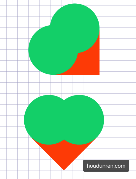
使用循环动画绘制心动效果

<style>
    .heart {
        width: 200px;
        height: 200px;
        background: #e74c3c;
        transform: rotate(45deg);
        position: relative;
        animation-name: heart;
        animation-duration: 1s;
        animation-iteration-count: 100;
    }

    .heart::before {
        content: '';
        width: 200px;
        height: 200px;
        border-radius: 50%;
        background: #e74c3c;
        position: absolute;
        transform: translate(-50%, 0px);
    }

    .heart::after {
        content: '';
        width: 200px;
        height: 200px;
        border-radius: 50%;
        background: #e74c3c;
        position: absolute;
        transform: translate(0%, -50%);
    }

    @keyframes heart {
        from {
            transform: scale(.3) rotate(45deg);
        }

        to {
            transform: scale(1) rotate(45deg);
        }
    }
</style>

<main>
	<div class="heart"></div>
</main>
动画方向
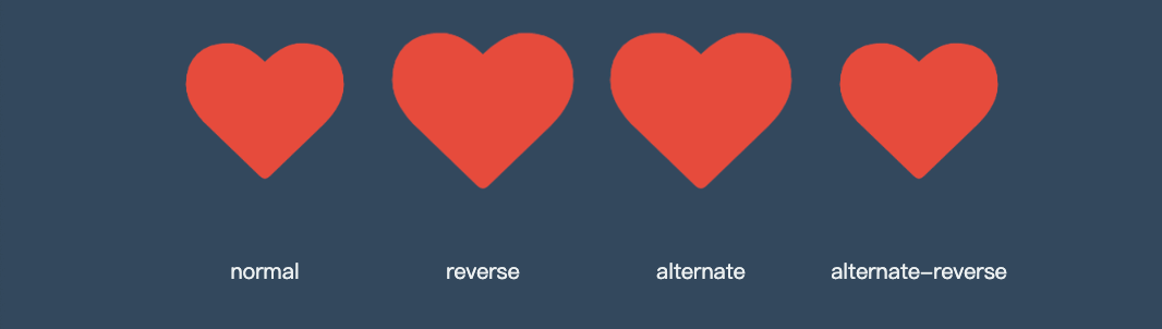
使用 animation-direction 控制动画运行的方向。
| 选项 | 说明 |
|---|---|
| normal | 从 0%到 100%运行动画 |
| reverse | 从 100%到 0%运行动画 |
| alternate | 先从 0%到 100%,然后从 100%到 0% |
| alternate-reverse | 先从 100%到 0%,然后从 0%到 100% |
效果比较
<head>
    <link rel="stylesheet" href="https://maxcdn.bootstrapcdn.com/font-awesome/4.7.0/css/font-awesome.min.css">
    <style>
        * {
            padding: 0;
            margin: 0;
        }

        h2 {
            color: #f39c12;
        }

        body {
            width: 100vw;
            height: 100vh;
            background: #34495e;
            display: flex;
            flex-direction: column;
            justify-content: center;
            align-items: center;
        }

        ul {
            width: 400px;
            height: 100px;
            display: flex;
        }

        li {
            list-style: none;
            text-align: center;
            display: flex;
            flex-direction: column;
            flex: 1;
            justify-content: space-between;
        }

        li span {
            font-size: 10px;
            color: #ecf0f1;
        }

        i.fa {
            font-size: 30px;
            margin: 5px;
            color: #e74c3c;
            animation-name: hd;
            animation-duration: 2s;
            animation-iteration-count: infinite;
        }

        li:nth-child(1)>i.fa {
            animation-direction: normal;
        }

        li:nth-child(2)>i.fa {
            animation-direction: reverse;
        }

        li:nth-child(3)>i.fa {
            animation-direction: alternate;
        }

        li:nth-child(4)>i.fa {
            animation-direction: alternate-reverse;
        }

        @keyframes hd {
            from {}

            to {
                opacity: 1;
                transform: scale(3);
            }
        }
    </style>
</head>

<body>
    <ul>
        <li>
            <i class="fa fa-heart" aria-hidden="true"></i>
            <span>normal</span>
        </li>
        <li>
            <i class="fa fa-heart" aria-hidden="true"></i>
            <span>reverse</span>
        </li>
        <li>
            <i class="fa fa-heart" aria-hidden="true"></i>
            <span>alternate</span>
        </li>
        <li>
            <i class="fa fa-heart" aria-hidden="true"></i>
            <span>alternate-reverse</span>
        </li>
    </ul>
</body>
reverse
根据上面的心动例子改变方向为 100%~0%

alternate
根据上面的心动例子改变方向为 0%~100%然后 100%~0%

animation-direction: alternate-reverse;alternate-reverse
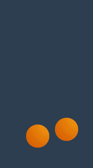
通过使用合适的运动方向 alternate-reverse 制作跳动的小球
<style>
    main {
        display: flex;
        flex-direction: column;
        justify-content: center;
        align-items: center;
    }

    div {
        width: 200px;
        height: 200px;
        border-radius: 50%;
        background: #e67e22;
        animation-name: ball;
        animation-duration: 2s;
        animation-iteration-count: infinite;
        animation-direction: alternate-reverse;
    }

    @keyframes ball {
        0% {}

        100% {
            transform: translateY(-600px);
        }
    }

    section {
        width: 400px;
        height: 10px;
        border-radius: 50%;
        animation-name: shadow;
        animation-duration: 2s;
        animation-iteration-count: infinite;
        animation-direction: alternate;
    }

    @keyframes shadow {
        from {
            background: #000;
            transform: scale(1);
            filter: blur(35px);
        }

        to {
            background: #aaa;
            filter: blur(10px);
        }
    }
</style>

<main>
	<div></div>
	<section></section>
</main>
延迟动画
使用 animation-delay 规则定义动画等待多长时间后执行。
微场景

<style>
    body {
        width: 100vw;
        height: 100vh;
        display: flex;
        flex-direction: column;
        justify-content: space-between;
    }

    header {
        width: 100vw;
        height: 10vh;
        font-size: 2.5em;
        color: white;
        background: #e74c3c;
        text-align: center;
        line-height: 10vh;
        animation-name: hd-translate;
        animation-duration: 500ms;
    }

    main {
        flex: 1;
        width: 100vw;
        height: 300px;
        left: 0;
        bottom: 0;
        background: url("5.jpg") no-repeat right bottom;
        background-size: cover;
        display: flex;
        flex-direction: column;
        justify-content: center;
        align-items: center;
        transform: translateX(-100vw);
        animation-name: hd-rotate;
        animation-duration: 1s;
        animation-fill-mode: forwards;
    }

    main>* {
        opacity: .8;
        font-size: 1.2em;
        line-height: 2em;
        color: #f3f3f3;
        padding: 20px;
        border-radius: 10px;
        box-shadow: 0 0 5px rgba(0, 0, 0, .6);
    }

    main>.lesson {
        width: 80vw;
        height: 40vw;
        background: #8e44ad;
        transform: translate(-100vw, -100vh);
        animation-name: hd-rotate;
        animation-duration: 1s;
        animation-delay: 1s;
        animation-fill-mode: forwards;
    }

    main>.video {
        margin-top: 20px;
        width: 60vw;
        height: 40vw;
        background: #2980b9;
        animation-name: hd-translate;
        animation-duration: 1s;
        animation-delay: 2s;
        transform: translate(-100vw, -100vh);
        animation-fill-mode: forwards;
    }

    footer {
        width: 100vw;
        height: 10vh;
        font-size: 1.5em;
        color: white;
        background: #27ae60;
        text-align: center;
        line-height: 10vh;
        animation-name: hd-skew;
        animation-duration: 500ms;
        animation-delay: 3s;
        transform: translateX(-100vw);
        animation-fill-mode: forwards;
    }

    @keyframes hd-translate {
        from {
            transform: translate(-100vw, -100vh);
        }

        to {
            transform: translateY(0);
        }
    }

    @keyframes hd-rotate {
        from {
            transform: translate(-100%, -100%);
        }

        to {
            transform: translateX(0) rotate(360deg);
        }
    }

    @keyframes hd-skew {
        from {
            transform: translateX(-100%) skew(-45deg);
        }

        to {
            transform: skewX(0deg);
        }
    }
</style>

<body>
    <header>
        后盾人
    </header>
    <main>
        <div class="lesson">
            系统课程是多个实战课程的组合,用来全面掌握一门语言或软件的使用,尤其适合刚入门的新手系统牢固的掌握知识。
        </div>
        <div class="video hd-translate">
            系统课程是多个实战课程的组合,用来全面掌握一门语言或软件的使用,尤其适合刚入门的新手系统牢固的掌握知识。
        </div>
    </main>
    <footer>
        houdunren.com
    </footer>
</body>
动画速率
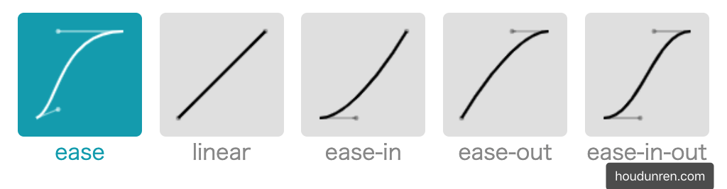
系统属性
| 值 | 描述 |
|---|---|
| linear | 规定以相同速度开始至结束的过渡效果(等于 cubic-bezier(0,0,1,1))。 |
| ease | 开始慢,然后快,慢下来,结束时非常慢(cubic-bezier(0.25,0.1,0.25,1)) |
| ease-in | 开始慢,结束快(等于 cubic-bezier(0.42,0,1,1)) |
| ease-out | 开始快,结束慢(等于 cubic-bezier(0,0,0.58,1)) |
| ease-in-out | 中间快,两边慢(等于 cubic-bezier(0.42,0,0.58,1)) |
| cubic-bezier(n,n,n,n) | 在 cubic-bezier 函数中定义自己的值 |
- 可以在帧中单独定义,将影响当前帧的速率
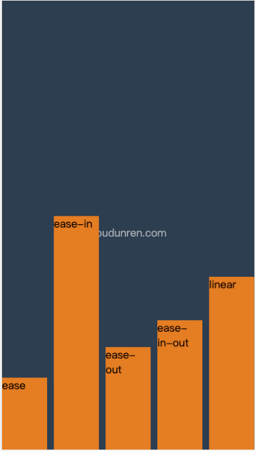
贝塞尔曲线
需要设置四个值 cubic-bezier(<x1>, <y1>, <x2>, <y2>),来控制曲线速度,可在 https://cubic-bezier.com 网站在线体验效果。
体验效果
<head>
    <meta charset="UTF-8">
    <meta name="viewport" content="width=device-width, initial-scale=1.0">
    <title>后盾人</title>
    <style>
        * {
            padding: 0;
            margin: 0;
        }

        body {
            width: 100vw;
            height: 100vh;
            background: #2c3e50;
            display: grid;
            grid-template-columns: 1fr;
        }

        body::before {
            content: 'houdunren.com';
            color: white;
            position: absolute;
            left: 50%;
            top: 50%;
            transform: translateX(-50%);
            opacity: .5;
        }

        ul {
            box-sizing: border-box;
            list-style: none;
            display: grid;
            grid-template-columns: repeat(5, 1fr);
            gap: 10px;
        }

        li {
            box-sizing: border-box;
            background: #e67e22;
            animation-name: move;
            animation-duration: 3s;
            animation-iteration-count: infinite;
            color: #333333;
        }

        li:nth-child(1) {
            animation-timing-function: ease;
        }

        li:nth-child(2) {
            animation-timing-function: ease-in;
        }

        li:nth-child(3) {
            animation-timing-function: ease-out;
        }

        li:nth-child(4) {
            animation-timing-function: ease-in-out;
        }

        li:nth-child(5) {
            animation-timing-function: linear;
        }

        @keyframes move {
            to {
                transform: translateY(90vh);
            }
        }
    </style>
</head>

<body>
    <ul>
        <li>ease</li>
        <li>ease-in</li>
        <li>ease-out</li>
        <li>ease-in-out</li>
        <li>linear</li>
    </ul>
</body>
弹跳小球
<head>
<style>
body {
width: 100vw;
height: 100vh;
display: flex;
flex-direction: column;
justify-content: flex-end;
align-items: flex-start;
background: #2c3e50;
}
div {
position: absolute;
width: 100px;
height: 100px;
left: 30%;
top: 0px;
transform: translate(0vw, 0);
background: radial-gradient(at right top, #f39c12, #d35400);
border-radius: 50%;
animation-name: jump;
animation-duration: 2s;
animation-iteration-count: infinite;
animation-timing-function: ease-in;
}
div:nth-child(2) {
animation-delay: .2s;
left: 60%;
}
@keyframes jump {
0% {
transform: translateY(0);
animation-timing-function: ease-in;
}
30% {
transform: translateY(10vh);
animation-timing-function: ease-in;
}
60% {
transform: translateY(40vh);
animation-timing-function: ease-in;
}
80% {
transform: translateY(60vh);
animation-timing-function: ease-in;
}
95% {
transform: translateY(75vh);
animation-timing-function: ease-in;
}
15%,
45%,
70%,
85%,
100% {
transform: translateY(80vh);
animation-timing-function: ease-out;
}
}
</style>
</head>
<body>
<div></div>
<div></div>
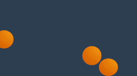
</body>魔术小球
<style>
    body {
        width: 100vw;
        height: 100vh;
        display: flex;
        flex-direction: column;
        justify-content: flex-end;
        align-items: flex-start;
        background: #2c3e50;
    }

    div {
        position: absolute;
        width: 100px;
        height: 100px;
        transform: translate(-20vw, -300%);
        background: radial-gradient(at right top, #f39c12, #d35400);
        border-radius: 50%;
        animation-name: jump;
        animation-duration: 1.5s;
        animation-iteration-count: infinite;
        animation-timing-function: ease-in;
    }

    div:nth-child(2) {
        animation-delay: .2s;
    }

    div:nth-child(3) {
        animation-delay: 1s;
    }

    @keyframes jump {
        0% {
            transform: translate(-20vw, -300%);
        }

        10% {
            transform: scaleY(.9) translate(15vw, 0%);
        }

        20% {
            transform: translate(20vw, -200%);
        }

        30% {
            transform: scaleY(.9) translate(30vw, 0%);
        }

        40% {
            transform: translate(40vw, -120%);
        }

        50% {
            transform: scaleY(.9) translate(50vw, 0%);
        }

        60% {
            transform: translate(60vw, -70%);
        }

        70% {
            transform: scaleY(.9) translate(70vw, 0%);
        }

        80% {
            transform: translate(80vw, -50%);
        }

        90% {
            transform: scaleY(.9) translate(90vw, 0%);
        }

        95% {
            transform: translate(95vw, -30%);
        }

        100% {
            transform: scaleY(.9) translate(100vw, 0%);
        }
    }

    @keyframes move {
        0% {
            /* transform: translateY(-400%); */
        }

        100% {
            /* right: 100px; */
        }
    }
</style>

<body>
    <div></div>
    <div></div>
    <div></div>
</body>
按钮提交

<head>
    <style>
        body {
            width: 100vw;
            height: 100vh;
            display: flex;
            justify-content: center;
            align-items: center;
            background: #34495e;
        }

        button {
            padding: 10px 50px;
            outline: none;
            background: #e67e22;
            font-size: 2em;
            border: solid 5px white;
            color: white;
        }

        button::after {
            content: '';
            display: inline-block;
            height: 3px;
            width: 3px;
            box-shadow: 3px 0 currentColor, 9px 0 currentColor, 15px 0 currentColor;
            animation-name: point;
            animation-duration: 1s;
            animation-iteration-count: infinite;
            animation-timing-function: linear;
            margin-left: 5px;
        }

        @keyframes point {
            from {
                box-shadow: none;
            }

            30% {
                box-shadow: 3px 0 currentColor;
            }

            60% {
                box-shadow: 3px 0 currentColor, 9px 0 currentColor;
            }

            90% {
                box-shadow: 3px 0 currentColor, 9px 0 currentColor, 15px 0 currentColor;
            }
        }
    </style>
</head>

<body>
    <button>
        <i class="fa fa-code" aria-hidden="true"></i>
        提交
    </button>
</body>
步进速度
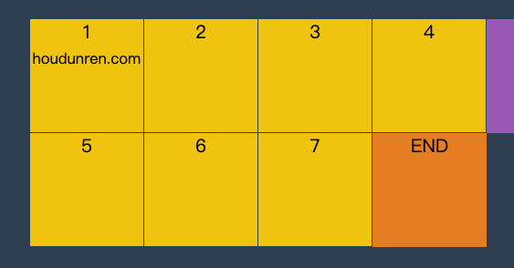
过渡使用阶梯化呈现,有点像现实生活中的机械舞,下面是把过渡分五步完成。
| 选项 | 说明 |
|---|---|
| steps(n,start) | 设置 n 个时间点,第一时间点变化状态 |
| steps(n,end) | 设置 n 个时间点,第一时间点初始状态 |
| step-start | 等于 steps(1,start),可以理解为从下一步开始 |
| step-end | 等于 steps(1,end),可以理解为从当前步开始 |
steps
steps(n,start) 可以简单理解为从第二个开始,steps(n,end) 从第一个开始。
<head>
<meta charset="UTF-8">
<meta name="viewport" content="width=device-width, initial-scale=1.0">
<title>后盾人</title>
<style>
* {
padding: 0;
margin: 0;
}
body {
width: 100vw;
height: 100vh;
background: #2c3e50;
display: grid;
/* justify-content: center;
align-content: center; */
}
main {
justify-self: center;
align-self: center;
width: 400px;
height: 200px;
display: grid;
grid-template: repeat(2, 1fr)/repeat(4, 1fr);
}
div {
background: #f1c40f;
text-align: center;
position: relative;
border-right: solid 1px #2c3e50;
border-bottom: solid 1px #2c3e50;
box-sizing: border-box;
}
div:nth-child(5)::before {
content: 'END';
position: absolute;
width: 100px;
height: 100px;
background: #e67e22;
left: 0;
animation-name: move;
animation-duration: 2s;
z-index: 2;
animation-timing-function: steps(4, end);
animation-iteration-count: infinite;
}
div:nth-child(1)::after {
content: 'START';
position: absolute;
width: 100px;
height: 100px;
background: #9b59b6;
animation-name: move;
animation-duration: 2s;
animation-timing-function: steps(4, start);
animation-iteration-count: infinite;
z-index: 2;
left: 0;
top: 0;
}
@keyframes move {
to {
transform: translateX(400px);
}
}
</style>
</head>
<body>
<main>
<div>1 <small>houdunren.com</small></div>
<div>2</div>
<div>3</div>
<div>4</div>
<div>5</div>
<div>6</div>
<div>7</div>
<div>8</div>
</main>
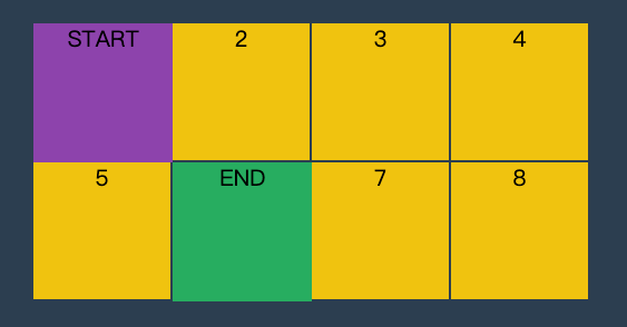
</body>step-start
step-start 效果等于 steps(1,start) ,step-end 效果等同于 steps(1,end)。
<head>
    <meta charset="UTF-8">
    <meta name="viewport" content="width=device-width, initial-scale=1.0">
    <title>后盾人</title>
    <style>
        * {
            padding: 0;
            margin: 0;
        }

        body {
            width: 100vw;
            height: 100vh;
            background: #2c3e50;
            display: grid;
        }

        main {
            align-self: center;
            justify-self: center;
            width: 400px;
            height: 200px;
            display: grid;
            grid-template: repeat(2, 1fr)/repeat(4, 1fr);
        }

        div {
            text-align: center;
            background: #f1c40f;
            border: solid 1px #2c3e50;
            box-sizing: border-box;
            position: relative;
        }

        div:nth-child(1)::before,
        div:nth-child(5)::before {
            animation-name: hd;
            animation-iteration-count: infinite;
            animation-duration: .5s;
            z-index: 2;
        }

        div:nth-child(1)::before {
            content: 'START';
            width: 100px;
            height: 100px;
            background: #8e44ad;
            position: absolute;
            left: 0;
            top: 0;
            animation-timing-function: step-start;
        }

        div:nth-child(5)::before {
            content: 'END';
            width: 100px;
            height: 100px;
            background: #27ae60;
            position: absolute;
            left: 0;
            top: 0;
            animation-timing-function: step-end;
        }

        @keyframes hd {
            50% {
                transform: translateX(100px);
            }

            to {
                transform: translateX(0px);
            }
        }
    </style>
</head>

<body>
    <main>
        <div>1</div>
        <div>2</div>
        <div>3</div>
        <div>4</div>
        <div>5</div>
        <div>6</div>
        <div>7</div>
        <div>8</div>
    </main>
</body>
播放状态
使用 animation-play-state 可以控制动画的暂停与运行。
| 选项 | 说明 |
|---|---|
| paused | 暂停 |
| running | 运行 |
幻灯片
下面是使用无 JS 脚本参与的图片轮换效果,图片切换使用steps 步进与animation-play-state播放状态技术。

<head>
<link rel="stylesheet" href="https://maxcdn.bootstrapcdn.com/font-awesome/4.7.0/css/font-awesome.min.css">
<script src='https://code.jquery.com/jquery-3.3.1.slim.min.js'></script>
<style>
* {
padding: 0;
margin: 0;
}
body {
width: 100vw;
height: 100vh;
display: flex;
justify-content: center;
align-items: center;
background: #2c3e50;
}
main {
width: 400px;
border: solid 5px #ddd;
border-width: 5px 0 5px 0;
overflow: hidden;
position: relative;
}
main:hover section {
animation-play-state: paused;
}
main:hover ul::before {
animation-play-state: paused;
}
section {
width: 1600px;
height: 200px;
display: flex;
flex-direction: row;
animation-name: slide;
animation-duration: 4s;
animation-iteration-count: infinite;
animation-timing-function: steps(4, end);
}
section div {
width: 400px;
height: 200px;
overflow: hidden;
}
section div img {
width: 100%;
}
ul {
width: 200px;
position: absolute;
list-style: none;
display: flex;
justify-content: center;
align-items: center;
z-index: 3;
bottom: 20px;
left: 50%;
transform: translateX(-50%);
}
ul li {
font-size: 2em;
font-weight: bold;
color: white;
width: 50px;
height: 50px;
border-radius: 50%;
border: solid 3px transparent;
box-sizing: border-box;
display: flex;
justify-content: center;
align-items: center;
z-index: 2;
background: rgba(0, 0, 0, .3);
box-shadow: 0 0 3px rgba(0, 0, 0, 1);
}
ul::before {
content: '';
width: 50px;
height: 50px;
border-radius: 50%;
position: absolute;
background: #e74c3c;
left: 0;
animation-name: num;
animation-duration: 4s;
animation-iteration-count: infinite;
animation-timing-function: steps(4, end);
z-index: 1;
}
@keyframes slide {
from {
transform: translateX(0px);
}
to {
transform: translateX(-100%);
}
}
@keyframes num {
100% {
transform: translateX(200px);
}
}
</style>
</head>
<body>
<main>
<section>
<div>
<img src="1.jpg" alt="">
</div>
<div>
<img src="2.jpg" alt="">
</div>
<div>
<img src="3.jpg" alt="">
</div>
<div>
<img src="5.jpg" alt="">
</div>
</section>
<ul>
<li>1</li>
<li>2</li>
<li>3</li>
<li>4</li>
</ul>
</main>
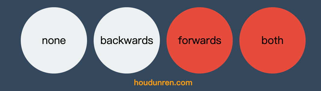
</body>填充模式
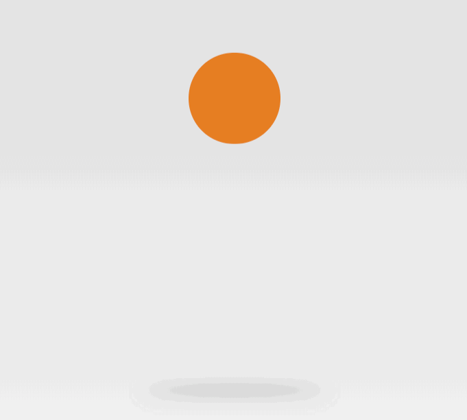
animation-fill-mode 用于定义动画播放结束后的处理模式,是回到原来状态还是停止在动画结束状态。
| 选项 | 说明 |
|---|---|
| none | 需要等延迟结束,起始帧属性才应用 |
| backwards | 动画效果在起始帧,不等延迟结束 |
| forwards | 结束后停留动画的最后一帧 |
| both | 包含 backwards 与 forwards 规则,即动画效果在起始帧,不等延迟结束,并且在结束后停止在最后一帧 |
效果对比
<head>
    <style>
        * {
            padding: 0;
            margin: 0;
        }

        body {
            width: 100vw;
            height: 100vh;
            background: #34495e;
            display: flex;
            flex-direction: column;
            justify-content: center;
            align-items: center;
        }

        ul {
            display: flex;
            justify-content: center;
            align-items: center;
        }

        li {
            list-style: none;
            width: 200px;
            height: 200px;
            background: #ecf0f1;
            border-radius: 50%;
            animation-name: hd;
            animation-delay: 2s;
            animation-duration: 2s;
            text-align: center;
            font-size: 2em;
            line-height: 200px;
            margin: 10px;
        }

        li:nth-child(1) {
            animation-fill-mode: none;
        }

        li:nth-child(2) {
            animation-fill-mode: backwards;
        }

        li:nth-child(3) {
            animation-fill-mode: forwards;
        }

        li:nth-child(4) {
            animation-fill-mode: both;
        }

        @keyframes hd {
            0% {
                border-radius: 0;
                background: #9b59b6;
            }

            100% {
                border-radius: 50%;
                background: #e74c3c;
            }
        }
    </style>
</head>

<body>
    <ul>
        <li>none</li>
        <li>backwards</li>
        <li>forwards</li>
        <li>both</li>
    </ul>
    <h2>houdunren.com</h2>
</body>
组合定义
和 CSS 中的其他属性一样,可以使用animation组合定义帧动画。animation 属性是一个简写属性,用于设置六个动画属性:
- animation-name
- animation-duration
- animation-timing-function
- animation-delay
- animation-iteration-count
- animation-direction
必须存在 animation-duration属性,否则过渡时间为 0 没有动画效果。