Appearance
变形动画
基础知识
坐标系统
要使用元素变形操作需要掌握坐标轴,然后通过改变不同坐标来控制元素的变形。
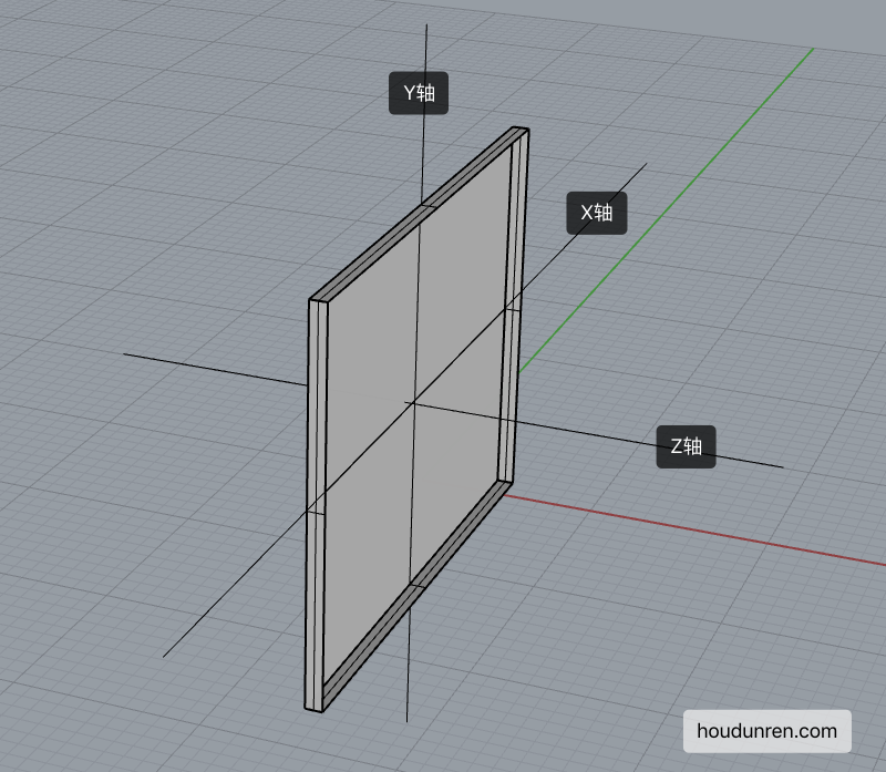
- X 轴是水平轴
- Y 轴是垂直轴
- Z 轴是纵深轴
变形操作
使用 transform 规则控制元素的变形操作,包括控制移动、旋转、倾斜、3D 转换等,下面会详细介绍每一个知识点。
下面是 CSS 提供的变形动作。
| 选项 | 说明 |
|---|---|
| none | 定义不进行转换。 |
| translate(x,y) | 定义 2D 转换。 |
| translate3d(x,y,z) | 定义 3D 转换。 |
| translateX(x) | 定义转换,只是用 X 轴的值。 |
| translateY(y) | 定义转换,只是用 Y 轴的值。 |
| translateZ(z) | 定义 3D 转换,只是用 Z 轴的值。 |
| scale(x,y) | 定义 2D 缩放转换。 |
| scale3d(x,y,z) | 定义 3D 缩放转换。 |
| scaleX(x) | 通过设置 X 轴的值来定义缩放转换。 |
| scaleY(y) | 通过设置 Y 轴的值来定义缩放转换。 |
| scaleZ(z) | 通过设置 Z 轴的值来定义 3D 缩放转换。 |
| rotate(angle) | 定义 2D 旋转,在参数中规定角度。 |
| rotate3d(x,y,z,angle) | 定义 3D 旋转。 |
| rotateX(angle) | 定义沿着 X 轴的 3D 旋转。 |
| rotateY(angle) | 定义沿着 Y 轴的 3D 旋转。 |
| rotateZ(angle) | 定义沿着 Z 轴的 3D 旋转。 |
| skew(x-angle,y-angle) | 定义沿着 X 和 Y 轴的 2D 倾斜转换。 |
| skewX(angle) | 定义沿着 X 轴的 2D 倾斜转换。 |
| skewY(angle) | 定义沿着 Y 轴的 2D 倾斜转换。 |
| perspective(n) | 为 3D 转换元素定义透视视图。 |
变形叠加
重复设置变形操作时只在原形态上操作。
默认处理
下面设置了两次移动,并不会移动 550px 而是只移动 50px。
<style>
    div {
        transform: translateX(500px);
        width: 100px;
        height: 100px;
        background: #9b59b6;
    }

    div:nth-child(1) {
        transform: translateX(50px);
    }
</style>

<div></div>
伪类叠加
<style>
    div {
        transition: 2s;
        transform: translateX(200px) translateX(50px);
        width: 100px;
        height: 100px;
        background: #9b59b6;
    }

    div:hover {
        transition: 2s;
        transform: translateX(100px);
    }
</style>

<div></div>
行级元素
行级元素不产生变形效果,将其转为 inline-block 或 block 以及弹性元素时都可以产生变化效果。

<style>
    span {
        display: inline-block;
        transition: 2s;
        transform: translateX(100px) translateX(50px);
        width: 100px;
        height: 100px;
        background: #9b59b6;
    }

    span:hover {
        transition: 2s;
        transform: translateX(100px);
    }
</style>

<span>hdcms</span>
伪类状态
:hover
鼠标移动上后发生改变。
article div:nth-child(2):hover {
	transform: rotate(180deg);
}
:target
以下操作变化时间为零秒,通过掌握后面的过渡动画可以控制变化时间。
<style>
article {
width: 300px;
height: 300px;
display: grid;
gap: 10px;
grid-template-columns: repeat(2, 1fr);
grid-template-rows: repeat(2, 1fr);
position: relative;
border: solid 5px silver;
color: white;
}
article div a {
color: white;
text-decoration: none;
}
article div,
article div aside {
background: blueviolet;
background-clip: content-box;
padding: 5px;
border: solid 2px blueviolet;
box-sizing: border-box;
display: flex;
justify-content: center;
align-items: center;
position: relative;
}
article div aside {
position: absolute;
display: none;
width: 100px;
height: 100px;
}
aside:target {
display: block;
transform: translateY(150px);
box-shadow: 0 0 10px #ddd;
}
</style>
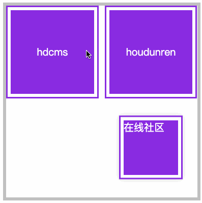
<article>
<div>
<a href="#hdcms">hdcms</a>
<aside id="hdcms">
内容管理系统
</aside>
</div>
<div>
<a href="#houdunren">houdunren</a>
<aside id="houdunren">
在线社区
</aside>
</div>
</article>移动元素
- 沿 X 轴移动时正值向右移动、负值向左移动
- 沿 Y 轴移动时正值向下移动、负值向上移动
- 如果使用百分数将控制元素的原尺寸计算百分比然后移动
- 可同时设置多个值,解析器会从左向右依次执行
- 变形是在原基础上更改,即第二次设置值时不是在第一次值上变化
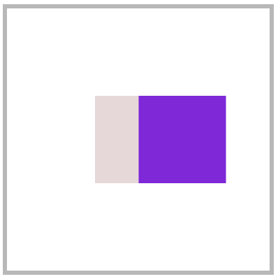
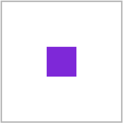
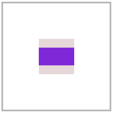
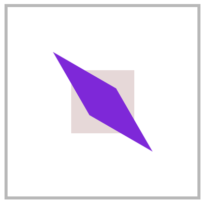
translateX
正值向右移动、负值向左移动。

<style>
article {
width: 300px;
height: 300px;
position: relative;
border: solid 5px silver;
}
article div {
width: 100px;
height: 100px;
background: blueviolet;
box-sizing: border-box;
position: absolute;
left: 50%;
margin-left: -50px;
top: 50%;
margin-top: -50px;
}
article div:nth-child(1) {
background: #e9dddd;
}
article div:nth-child(2) {
transform: translateX(100px);
}
</style>
...
<article>
<div></div>
<div></div>
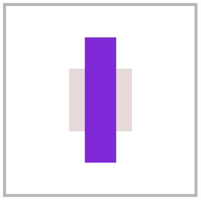
</article>translateY
正值向下移动、负值向上移动。

article div:nth-child(2) {
	transform: translateY(100px);
}
translate
使用 translate 可以控制按 X、Y 同时移动操作,第一个值控制 X 移动,第二个值控制 Y 移动。

article div:nth-child(2) {
	transform: translate(100px, -100px);
}
百分比移动
元素宽度为 100px 设置 50%时将移动 50px,即百分比是指元素的尺寸的百分比。
article div:nth-child(2) {
	transform: translateX(50%);
}
元素居中
居中可以使用多种方式,如弹性布局、定位操作,下面来看使用移动操作居中。
<style>
    body {
        height: 100vh;
    }

    main {
        width: 400px;
        height: 400px;
        border: solid 5px silver;
        position: relative;
    }

    main div {
        width: 100px;
        height: 100px;
        background: blueviolet;
        position: absolute;
        left: 50%;
        top: 50%;
        transform: translate(-50%, -50%);
    }
</style>

<main>
    <div></div>
</main>
translateZ
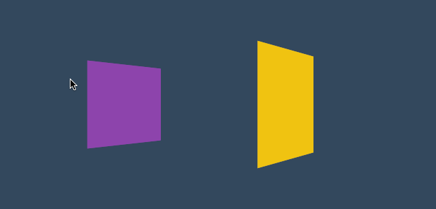
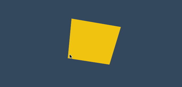
控制 Z 轴移动,正数向外、负数向里移动。因为 Z 轴是透视轴没有像 X/Y 一样的固定尺寸,所以不能使用百分数。
<style>
    * {
        padding: 0;
        margin: 0;
        box-sizing: border-box;
        list-style: none;
    }

    body {
        width: 100vw;
        height: 100vh;
        background: #34495e;
    }

    main {
        position: absolute;
        left: 50%;
        top: 50%;
        width: 200px;
        height: 200px;
        transform-style: preserve-3d;
        transition: 2s;
        transform: perspective(900px) rotateY(60deg);
    }

    body:hover main {
        transform: perspective(600px) rotateY(60deg) scaleZ(5);
    }

    div {
        position: absolute;
        top: 0;
        left: 0;
        width: 100%;
        height: 100%;
        background: #f1c40f;
    }

    div.b {
        background: #8e44ad;
        transform: translateZ(-100px);
    }
</style>

<main>
    <div class="f"></div>
    <div class="b"></div>
</main>
translate3d
用于同时控制 X/Y/Z 轴的移动,三个值必须输入如果某个轴不需要移动时设置为零。

<style>
* {
padding: 0;
margin: 0;
box-sizing: border-box;
list-style: none;
}
body {
width: 100vw;
height: 100vh;
background: #34495e;
}
main {
position: absolute;
left: 50%;
top: 50%;
width: 200px;
height: 200px;
background: #f1c40f;
perspective: 600px;
transform: perspective(600px) rotateY(35deg);
transition: 2s;
}
body:hover main {
transform: perspective(600px) rotateY(35deg) translate3d(50%, 50%, 200px);
}
</style>
<main>
<div></div>
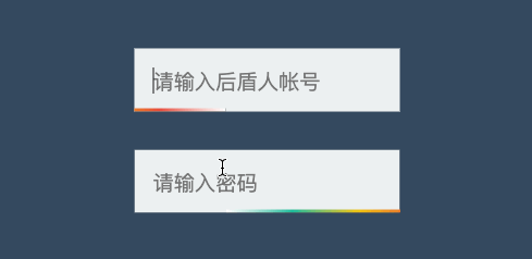
</main>渐变表单
<style>
    * {
        padding: 0;
        margin: 0;
        box-sizing: border-box;
    }

    body {
        width: 100vw;
        height: 100vh;
        background: #34495e;
    }

    main {
        position: absolute;
        left: 50%;
        top: 50%;
        transform: translate(-50%, -50%);
        width: 300px;
        height: 300px;
        border: solid 5px silver;
        display: flex;
        flex-direction: column;
        justify-content: center;
        align-items: center;
    }

    .field {
        position: relative;
        overflow: hidden;
        margin-bottom: 20px;
    }

    .field::before {
        content: '';
        position: absolute;
        left: 0;
        height: 2px;
        bottom: 0;
        width: 100%;
        background: linear-gradient(to right, white, #1abc9c, #f1c40f, #e74c3c, white);
        transform: translateX(-100%);
        transition: 2s;
    }

    .field:hover::before {
        transform: translateX(100%);
    }

    .field input {
        border: none;
        outline: none;
        background: #ecf0f1;
        padding: 10px;
    }
</style>

<main>
    <div class="field">
        <input type="text" placeholder="请输入后盾人帐号">
    </div>
    <div class="field">
        <input type="text" placeholder="请输入密码">
    </div>
</main>
页面切换
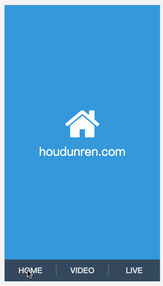
下面是使用移动效果制作的页面切换效果。
<link rel="stylesheet" href="https://maxcdn.bootstrapcdn.com/font-awesome/4.7.0/css/font-awesome.min.css">
<style>
    * {
        padding: 0;
        margin: 0;
    }

    a {
        text-decoration: none;
    }

    body {
        display: flex;
        width: 100vw;
        height: 100vh;
        flex-direction: column;
    }

    main {
        position: relative;
        background: #f3f3f3;
        flex: 1;
        overflow: hidden;
    }

    nav {
        display: flex;
        justify-content: space-around;
        align-items: center;
        height: 8vh;
        text-align: center;
        background: #34495e;
    }

    nav a {
        flex: 1;
        font-size: 1.3em;
        text-transform: uppercase;
        font-weight: bold;
        opacity: .8;
        color: white;
    }

    nav a:nth-child(2) {
        border-right: solid 1px #aaa;
        border-left: solid 1px #aaa;
    }

    main>div {
        position: absolute;
        left: 0;
        top: 0;
        width: 100%;
        height: 100%;
        transition: all 1s;
        z-index: 1;
        background: #f3f3f3;
        opacity: 0;
        display: flex;
        flex-direction: column;
        justify-content: center;
        align-items: center;
        transform: translate(0, -100%);
        color: white;
        font-size: 2em;
    }

    main>div:target {
        opacity: 1;
        transform: translate(0%, 0%);
    }

    main>div:nth-of-type(1):target {
        background: #3498db;
    }

    main>div:nth-of-type(2):target {
        background: #9b59b6;
    }

    main>div:nth-of-type(3):target {
        background: #16a085;
    }

    div i[class^="fa"] {
        font-size: 100px;
        color: white;
    }
</style>

<body>
    <main>
        <div id="home">
            <i class="fa fa-home" aria-hidden="true"></i>
            houdunren.com
        </div>
        <div id="video">
            <i class="fa fa-vimeo" aria-hidden="true"></i>
        </div>
        <div id="live">
            <i class="fa fa-viadeo" aria-hidden="true"></i>
        </div>
    </main>
    <nav>
        <a href="#home">home</a>
        <a href="#video">video</a>
        <a href="#live">live</a>
    </nav>
</body>
缩放元素
比如数值为 2 时表示为原尺寸的两倍。
scaleX
下面是沿 X 轴缩放一半。
article div:nth-child(2) {
	transform: scaleX(.5);
}
scaleY
下面是沿 Y 轴缩放一半。
article div:nth-child(2) {
	transform: scaleY(.5);
}
scale
使用 scale 可同时设置 X/Y 轴的缩放,如果只设置一个值时表示两轴缩放相同。
使用数值定义缩放,如 .5 表示缩小一半,2 表示放大两倍。
article div:nth-child(2) {
	transform: scale(.5, 2);
}
scaleZ
沿 Z 轴缩放元素,需要有 3D 透视才可以查看到效果。
<style>
    * {
        padding: 0;
        margin: 0;
        box-sizing: border-box;
    }

    body {
        width: 100vw;
        height: 100vh;
    }

    main {
        position: absolute;
        left: 50%;
        top: 50%;
        transform: translate(-50%, -50%);
        width: 400px;
        height: 400px;
        border: solid 5px silver;
        transform-style: preserve-3d;
        transform: perspective(900px) rotateY(45deg);
        transition: 3s;
    }

    div {
        position: absolute;
        left: 50%;
        top: 50%;
        margin-left: -100px;
        margin-top: -100px;
        width: 200px;
        height: 200px;
    }

    div:nth-child(1) {
        background: #2ecc71;
    }

    div:nth-child(2) {
        background: #e67e22;
        transition: 1s;
        transform: translateZ(-300px);
    }

    body:hover main {

        transform: perspective(900px) rotateY(45deg) scaleZ(3);
    }
</style>

<main>
    <div></div>
    <div></div>
</main>
scale3d
沿 X/Y/Z 三个轴绽放元素。

<style>
* {
padding: 0;
margin: 0;
box-sizing: border-box;
list-style: none;
}
body {
width: 100vw;
height: 100vh;
background: #34495e;
}
main {
position: absolute;
left: 50%;
top: 50%;
width: 200px;
height: 200px;
transform-style: preserve-3d;
transition: 2s;
transform: perspective(900px) rotateY(60deg)
}
body:hover main {
transform: perspective(600px) rotateY(60deg) scale3d(2, 2, 4);
}
div {
position: absolute;
top: 0;
left: 0;
width: 100%;
height: 100%;
background: #f1c40f;
}
div.b {
background: #8e44ad;
transform: translateZ(-100px);
}
</style>
<main>
<div class="f"></div>
<div class="b"></div>
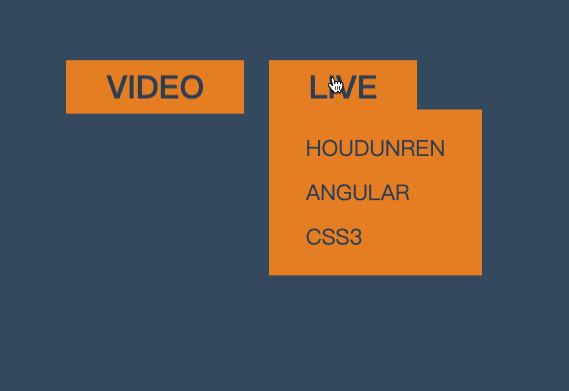
</main>菜单缩放
<style>
    * {
        padding: 0;
        margin: 0;
    }

    body {
        background: #34495e;
    }

    main {
        position: absolute;
        left: 50%;
        top: 50%;
        transform: translate(-50%, -50%);
    }

    ul {
        list-style: none;
        display: flex;
        justify-content: space-evenly;
        width: 200px;
    }

    ul li {
        position: relative;
    }

    ul li strong {
        background: #e67e22;
        color: #2c3e50;
        padding: 2px 20px;
        cursor: pointer;
        text-transform: uppercase;
    }

    ul li strong+div {
        border: solid 2px #e67e22;
        display: flex;
        flex-direction: column;
        padding: 10px 20px;
        position: absolute;
        transform-origin: left top;
        transform: scale(0);
        z-index: -1;
        transition: .6s;
        background: #e67e22;
    }

    ul li strong+div a {
        display: inline-block;
        padding: 5px;
        font-size: 1em;
        color: #2c3e50;
        text-decoration: none;
        text-transform: uppercase;
    }

    ul li:hover strong+div {
        transform: scale(1);
    }
</style>

<main>
    <ul>
        <li>
            <strong>VIDEO</strong>
            <div>
                <a href="">PHP</a>
                <a href="">hdcms</a>
                <a href="">laravel</a>
            </div>
        </li>
        <li>
            <strong>LIVE</strong>
            <div>
                <a href="">houdunren</a>
                <a href="">angular</a>
                <a href="">css3</a>
            </div>
        </li>
    </ul>
</main>
相册放大
下面是使用缩放开发相册放大效果的示例。
<style>
    body {
        display: flex;
        justify-content: center;
        align-items: center;
        height: 100vh;
        background: #ddd;
    }

    main {
        display: flex;
        justify-content: center;
        align-items: center;
    }

    main div {
        height: 200px;
        width: 200px;
        background: white;
        border: solid 1px #ddd;
        transition: all .5s;
        display: flex;
        justify-content: center;
        align-items: center;
        font-size: 1.5em;
        text-transform: uppercase;
        color: blueviolet;
        overflow: hidden;
        border: solid 3px #555;
        box-sizing: border-box;
    }

    main div img {
        height: 100%;
    }

    main:hover div {
        transform: scale(.8) translateY(-30px);
        cursor: pointer;
        filter: blur(15px);
    }

    main div:hover {
        transform: scale(1.6);
        color: white;
        filter: none;
        z-index: 2;
    }

    main div:hover::after {
        content: '';
        position: absolute;
        background: #000;
        width: 100%;
        height: 100%;
        z-index: -1;
        box-shadow: 0 0 5px rgba(0, 0, 0, .3);
    }
</style>

<main>
    <div>
        <img src="1.jpg" alt="">
    </div>
    <div> <img src="2.jpg" alt=""></div>
    <div> <img src="3.jpg" alt=""></div>
</main>
旋转操作
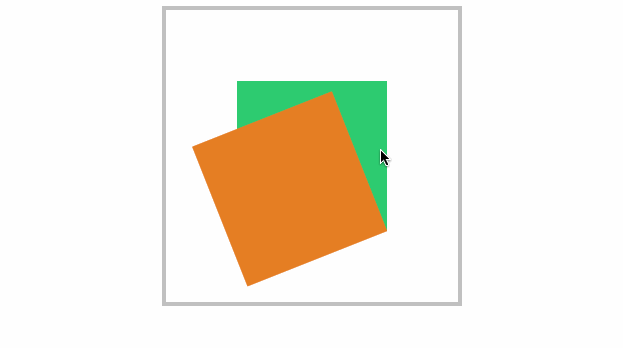
使用 CSS 可以控制元素按照不同坐标轴进行旋转。
rotateX
控制元素按照 X 轴进行旋转操作。
基本使用
按水平轴发生旋转,如果旋转 90deg 将不可见。
article div:nth-child(2) {
    transform: rotateX(180deg);
}
下面是旋转 89deg 后,只会看到一条线。
父级透视
当 X 旋转 90 度后无法看到元素,这时可以控制父级旋转从上看子元素。
<style>
    * {
        padding: 0;
        margin: 0;
        box-sizing: border-box;
    }

    main {
        position: absolute;
        left: 50%;
        top: 50%;
        margin-left: -200px;
        margin-top: -200px;
        width: 400px;
        height: 400px;
        border: solid 5px silver;
        transform-style: preserve-3d;
        transform: perspective(900px) rotateX(-45deg);
    }

    div {
        position: absolute;
        left: 50%;
        top: 50%;
        margin-left: -100px;
        margin-top: -100px;
        width: 200px;
        height: 200px;
        transition: 1s;
    }

    div:nth-child(1) {
        background: #2ecc71;
    }

    main:hover div:nth-child(1) {
        transform: perspective(900px) rotateX(90deg) rotateY(25deg) rotateZ(45deg);
    }
</style>

<main>
	<div></div>
</main>
rotateY
按垂直轴旋转,如果旋转 90deg 将不可见。
article div:nth-child(2) {
    transform: rotateY(180deg);
}
rotateZ
没 Z 轴旋转元素,效果就是沿 X/Y 轴的平面旋转。

<style>
    * {
        padding: 0;
        margin: 0;
        box-sizing: border-box;
        list-style: none;
    }

    body {
        width: 100vw;
        height: 100vh;
        background: #34495e;
    }

    main {
        position: absolute;
        left: 50%;
        top: 50%;
        width: 200px;
        height: 200px;
        background: #f1c40f;
        perspective: 600px;
        transform: perspective(600px) rotateY(35deg);
        transition: 2s;
    }

    body:hover main {
        transform: perspective(600px) rotateY(35deg) rotateZ(160deg);
    }
</style>

<main>
    <div></div>
</main>
rotate
在 X 与 Y 轴平面旋转,效果与使用 rotateZ 相同。
article div:nth-child(2) {
	transform: rotate(90deg);
}
rotate3d
同时设置 X/Y/Z 轴的旋转向量值来控制元素的旋转。
需要同时设置如下四个参数
rotate3d(tx,ty,tz,angle)只转 X 轴
<style>
    * {
        padding: 0;
        margin: 0;
        box-sizing: border-box;
        list-style: none;
    }

    body {
        width: 100vw;
        height: 100vh;
        background: #34495e;
    }

    main {
        position: absolute;
        left: 50%;
        top: 50%;
        width: 200px;
        height: 200px;
        background: #f1c40f;
        perspective: 600px;
        transform: perspective(600px) rotateY(35deg);
        transition: 2s;
    }

    body:hover main {
        transform: perspective(600px) rotateY(35deg) rotate3d(1, 0, 0, -645deg);
    }
</style>

<main>
	<div></div>
</main>
只转 Y 轴

body:hover main {
	transform: perspective(600px) rotateY(-645deg);
}
只转 Z 轴
XY 旋转
body:hover main {
	transform: perspective(600px) rotateY(35deg) rotate3d(1, 1, 0, -645deg);
}
XZ 转换
加入适当的 Z 向量值,可增加元素沿 Z 轴旋转的力度。

body:hover main {
	transform: perspective(600px) rotateY(35deg) rotate3d(1, 0, .5, -245deg);
}
参数顺序
可以同时设置多个旋转规则,顺序不同结果也会不同。
article div:nth-child(2) {
	transform: rotateX(30deg) rotateY(30deg);
}
旋转文字

<style>
    * {
        padding: 0;
        margin: 0;
    }

    body {
        height: 100vh;
        display: flex;
        flex-direction: column;
        justify-content: center;
        align-items: center;
    }

    main {
        margin: 0 auto;
        width: 400px;
        height: 50vh;
        display: flex;
        flex-direction: column;
        justify-content: center;
        align-items: center;
        background: #535c68;
    }

    main div {
        color: #c7ecee;
        cursor: pointer;
    }

    main div strong {
        display: inline-block;
        width: 25px;
        height: 25px;
        margin: 0 3px;
        background: #000;
        border-radius: 50%;
        transition: 2s;
        color: white;
        text-align: center;
        box-shadow: 0 2px 10px rgba(0, 0, 0, .3);
    }

    main div strong:nth-of-type(1) {
        background: #f0932b;
    }

    main div strong:nth-of-type(2) {
        background: #6ab04c;
    }

    main div:hover strong:nth-of-type(1) {
        transform: rotate(360deg);
    }

    main div:hover strong:nth-of-type(2) {
        transform: rotate(-360deg);
    }
</style>

<main>
    <div>
        <strong>h</strong>ou<strong>d</strong>unren.com
    </div>
</main>
电子时钟

<style>
body {
display: flex;
justify-content: center;
align-items: center;
height: 100vh;
background: #34495e;
}
main {
position: relative;
width: 400px;
height: 400px;
background: #34495e;
border-radius: 50%;
box-shadow: 0 0 10px rgba(0, 0, 0, .7);
}
main::before {
position: absolute;
left: 0;
top: 0;
content: '';
width: 100%;
height: 100%;
border-radius: 50%;
transform: scale(1.2);
background: radial-gradient(at right, #27ae60, #e67e22, #e74c3c, #e67e22, #27ae60);
z-index: -1;
}
main .line>div {
position: absolute;
left: 50%;
top: 50%;
width: 10px;
height: 95%;
background: white;
}
main .line>div:nth-child(1) {
transform: translate(-50%, -50%) rotate(0deg);
}
main .line>div:nth-child(2) {
transform: translate(-50%, -50%) rotate(30deg);
}
main .line>div:nth-child(3) {
transform: translate(-50%, -50%) rotate(60deg);
}
main .line>div:nth-child(4) {
transform: translate(-50%, -50%) rotate(90deg);
}
main .line>div:nth-child(5) {
transform: translate(-50%, -50%) rotate(120deg);
}
main .line>div:nth-child(6) {
transform: translate(-50%, -50%) rotate(150deg);
}
main>div[class="mark"] {
position: absolute;
width: 100%;
height: 100%;
left: 0%;
top: 0%;
background: #34495e;
border-radius: 50%;
transform: scale(.8);
}
main>.point {
width: 20px;
height: 20px;
background: #e74c3c;
border-radius: 50%;
position: absolute;
top: 50%;
left: 50%;
transform: translate(-50%, -50%);
z-index: 2;
}
main .hour {
width: 15px;
position: absolute;
height: 25%;
background: #95a5a6;
left: 50%;
bottom: 50%;
transform: translate(-50%, 0);
}
main .minute {
width: 8px;
position: absolute;
height: 35%;
background: #3498db;
left: 50%;
bottom: 50%;
transform-origin: left bottom;
transform: translate(-50%, 0) rotate(60deg);
}
main .second {
width: 2px;
position: absolute;
height: 35%;
background: #f1c40f;
left: 50%;
bottom: 50%;
transform-origin: left bottom;
transform: translate(-50%, 0) rotate(90deg);
}
main:hover .second {
transition: 10s;
transform: rotate(260deg);
}
main .text {
font-size: 1.2em;
color: white;
position: absolute;
top: 50%;
left: 50%;
transform: translate(-50%, 20px);
text-transform: uppercase;
opacity: .5;
text-align: center;
}
</style>
<main>
<section class="line">
<div></div>
<div></div>
<div></div>
<div></div>
<div></div>
<div></div>
</section>
<div class="mark"></div>
<div class="point"></div>
<div class="hour"></div>
<div class="minute"></div>
<div class="second"></div>
<div class="text">
houdunren.com <br>
向军大叔
</div>
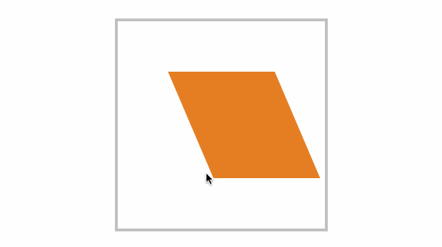
</main>倾斜操作
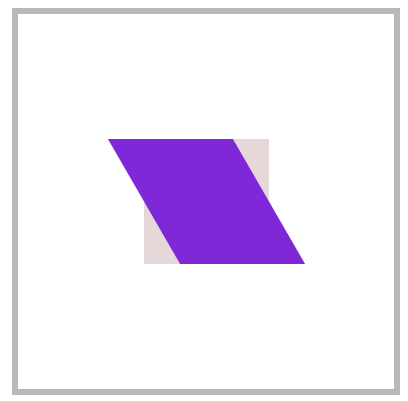
skewX
没 X 轴倾斜元素
article div:nth-child(2) {
transform: skewX(30deg);
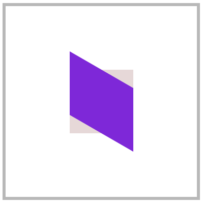
}skewY
沿 Y 轴倾斜元素
article div:nth-child(2) {
	transform: skewY(30deg);
}
skew
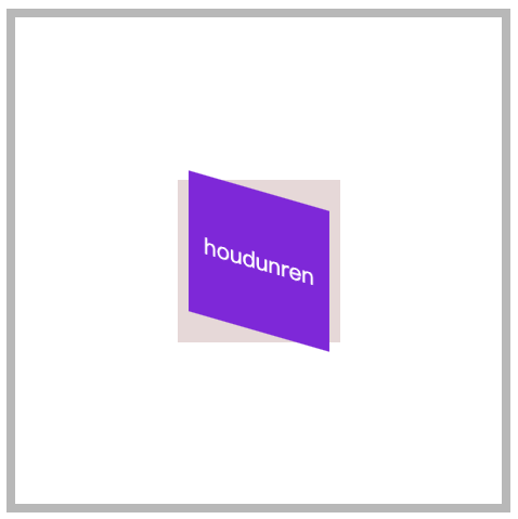
同时设置 X/Y 轴倾斜操作,不指定第二个参数时 Y 轴倾斜为零。
article div:nth-child(2) {
	transform: skew(30deg, 30deg);
}
按钮特效

<style>
    * {
        padding: 0;
        margin: 0;
    }

    body {
        background: #34495e;
    }

    main {
        position: absolute;
        left: 50%;
        top: 50%;
        transform: translate(-50%, -50%);
    }

    main .btn {
        display: block;
        height: 30px;
        width: 150px;
        border: solid 2px #e74c3c;
        background: none;
        color: white;
        position: relative;
        text-align: center;
        display: flex;
        justify-content: center;
        align-items: center;
        overflow: hidden;
        cursor: pointer;
        box-shadow: 0 3px 8px rgba(0, 0, 0, .3);
    }

    main .btn::before {
        transition: all .8s;
        align-self: center;
        content: '';
        position: absolute;
        width: 0;
        height: 100%;
        background: #e74c3c;
        z-index: -1;
        transform: skewX(-45deg);
    }

    main .btn:hover::before {
        width: 200%;
    }
</style>

<main>
    <a class="btn">
        HOUDUNREN
    </a>
</main>
立体按钮
<style>
    * {
        padding: 0;
        margin: 0;
        box-sizing: border-box;
    }

    body {
        background: #2c3e50;
        width: 100vw;
        height: 100vh;
        display: flex;
        justify-content: center;
        align-items: center;
    }

    .btn {
        color: #ecf0f1;
        text-decoration: none;
        width: 200px;
        height: 40px;
        background: #e74c3c;
        display: flex;
        justify-content: center;
        align-items: center;
        position: relative;
        transform: skewX(25deg) rotate(-15deg);
        letter-spacing: .5em;
        text-transform: uppercase;
        font-weight: bold;
    }

    .btn::before {
        content: '';
        width: 10px;
        height: 100%;
        left: -10px;
        background: #000;
        position: absolute;
        transform: skewY(-45deg) translate(0, 5px);
    }

    .btn::after {
        content: '';
        width: 100%;
        height: 10px;
        bottom: -10px;
        background: #000;
        position: absolute;
        transform: skewX(-45deg) translate(-5px, 0);
    }
</style>

<a href="" class="btn"> houdunren</a>
变形基点
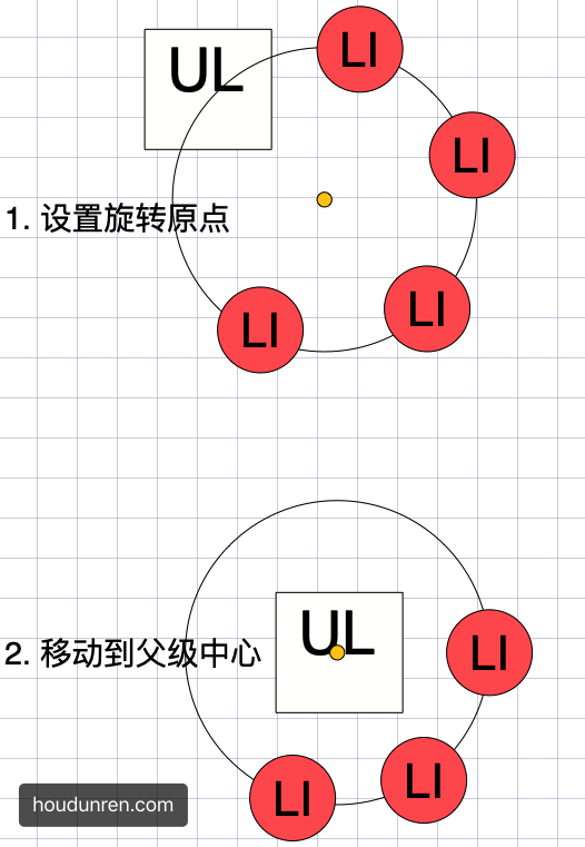
使用 transform-origin 设置元素的 X/YZ 操作的基点,用于控制旋转、倾斜等操作。
- 旋转默认以元素中心进行旋转,改变基点后可控制旋转点位置
- 元素移动不受变形基点所影响
- 基点是元素原始空间位,而不是 translate 移动后的空间位
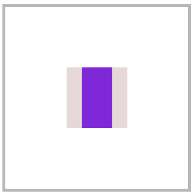
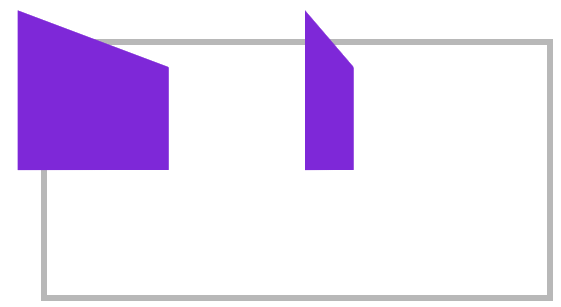
平面旋转
<style>
* {
padding: 0;
margin: 0;
box-sizing: border-box;
}
main {
position: absolute;
left: 50%;
top: 50%;
margin-left: -200px;
margin-top: -200px;
width: 400px;
height: 400px;
border: solid 5px silver;
}
div {
position: absolute;
left: 50%;
top: 50%;
margin-left: -100px;
margin-top: -100px;
width: 200px;
height: 200px;
transform-origin: right bottom;
}
div:nth-child(1) {
background: #2ecc71;
}
div:nth-child(2) {
background: #e67e22;
transition: 1s;
}
main:hover div:nth-child(2) {
transform: rotate(-45deg);
}
</style>
<main>
<div></div>
<div></div>
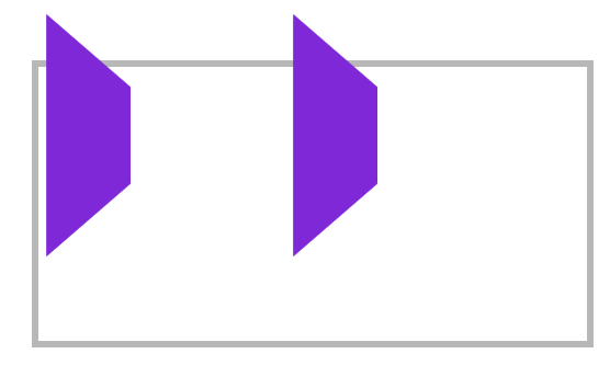
</main>倾斜控制
参考右上角控制倾斜。
<style>
* {
padding: 0;
margin: 0;
box-sizing: border-box;
}
main {
position: absolute;
left: 50%;
top: 50%;
margin-left: -200px;
margin-top: -200px;
width: 400px;
height: 400px;
border: solid 5px silver;
}
div {
position: absolute;
left: 50%;
top: 50%;
margin-left: -100px;
margin-top: -100px;
width: 200px;
height: 200px;
transform-origin: top left;
}
div:nth-child(1) {
background: #fff;
}
div:nth-child(2) {
background: #e67e22;
transition: 1s;
}
main:hover div:nth-child(2) {
transform: skew(45deg);
}
</style>
<main>
<div></div>
<div></div>
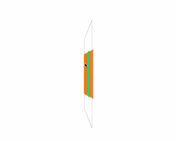
</main>三维旋转
<style>
    * {
        padding: 0;
        margin: 0;
        box-sizing: border-box;
    }

    main {
        position: absolute;
        left: 50%;
        top: 50%;
        margin-left: -200px;
        margin-top: -200px;
        width: 400px;
        height: 400px;
        border: solid 5px silver;
        transform-style: preserve-3d;
        transform: perspective(900px) rotateY(95deg);
    }

    div {
        position: absolute;
        left: 50%;
        top: 50%;
        margin-left: -100px;
        margin-top: -100px;
        width: 200px;
        height: 200px;
        transform-origin: center center 200px;
    }

    div:nth-child(1) {
        background: #2ecc71;
    }

    div:nth-child(2) {
        background: #e67e22;
        transition: 1s;
    }

    main:hover div:nth-child(2) {
        transform: rotateY(360deg);
    }
</style>

<main>
    <div></div>
    <div></div>
</main>
变形顺序的影响
设置 transform 变形的前后顺序对变形结果是有影响
我们通过下面的示例来说明这个问题
- 下面先写 rotate 后写 translate,即先按原位置的
transform-origin: top left进行旋转,再按原位置的transform-origin: top left进行移动
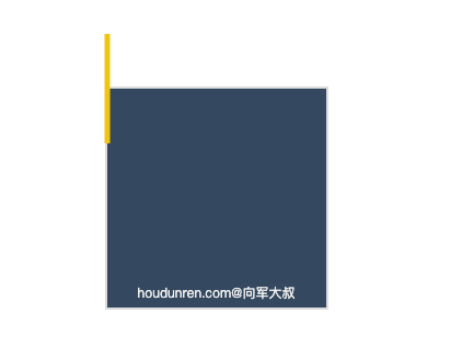
<style>
  body {
    width: 100vw;
    height: 100vh;
    display: flex;
    justify-content: center;
    align-items: center;
  }
  article {
    width: 200px;
    height: 200px;
    border: solid 2px #ddd;
    position: relative;
    background: #34495e;
  }
  article div {
    width: 5px;
    height: 100px;
    background: #000;
    transition: 2s;
    position: absolute;
    transform-origin: top left;
    transform: rotate(0deg) translate(-50%, -50%);
    background-color: #f1c40f;
  }
  article::after {
    content: 'houdunren.com@向军大叔';
    width: 100%;
    color: #f3f3f3;
    font-size: 12px;
    position: absolute;
    bottom: 5px;
    text-align: center;
  }
  article:hover div {
    transform: rotate(360deg) translate(-50%, -50%);
  }
</style>

<article>
  <div></div>
</article>
现在交换 rotate 与 translate的顺序后,表示先移动元素,这时候旋转就是参考移动后的位置的 transform-origin: top left;结果如下
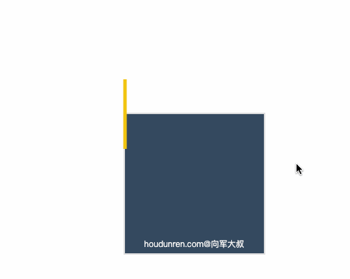
<style>
body {
width: 100vw;
height: 100vh;
display: flex;
justify-content: center;
align-items: center;
}
article {
width: 200px;
height: 200px;
border: solid 2px #ddd;
position: relative;
background: #34495e;
}
article div {
width: 5px;
height: 100px;
background: #000;
transition: 2s;
position: absolute;
transform-origin: top left;
transform: translate(-50%, -50%) rotate(0deg);
background-color: #f1c40f;
}
article::after {
content: 'houdunren.com@向军大叔';
width: 100%;
color: #f3f3f3;
font-size: 12px;
position: absolute;
bottom: 5px;
text-align: center;
}
article:hover div {
transform: translate(-50%, -50%) rotate(360deg);
}
</style>
<article>
<div></div>
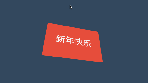
</article>新年贺卡
下面是通过设置基点来制作贺卡的效果。
<style>
* {
padding: 0;
margin: 0;
box-sizing: border-box;
}
body {
width: 100vw;
height: 100vh;
background: #34495e;
display: flex;
justify-content: center;
align-items: center;
}
main {
width: 300px;
height: 200px;
transform-style: preserve-3d;
transform: perspective(600px) rotateX(35deg) rotateY(15deg);
}
.card {
width: 300px;
height: 200px;
background: #e67e22;
display: flex;
justify-content: center;
align-items: center;
font-size: 3em;
color: whitesmoke;
position: relative;
}
.card::before,
.card::after {
transition: 1s;
background: #e74c3c;
line-height: 4em;
}
.card::before {
content: '新年';
width: 150px;
height: 100%;
left: 0px;
top: 0;
text-align: right;
position: absolute;
transform-origin: left bottom;
}
.card::after {
content: '快乐';
width: 150px;
height: 100%;
left: 150px;
top: 0;
position: absolute;
transform-origin: right bottom;
}
.card:hover::before {
transform: rotateY(-179deg);
}
.card:hover::after {
transform: rotateY(179deg);
}
</style>
<main>
<div class="card">houdunren</div>
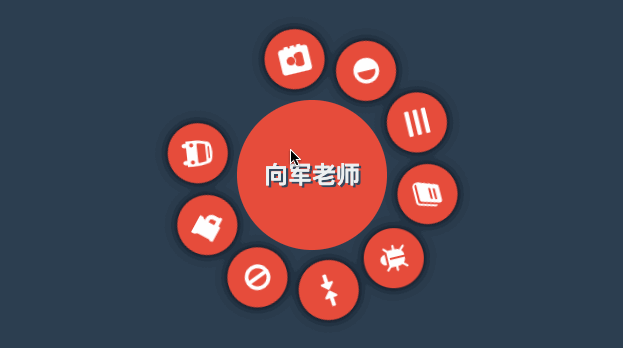
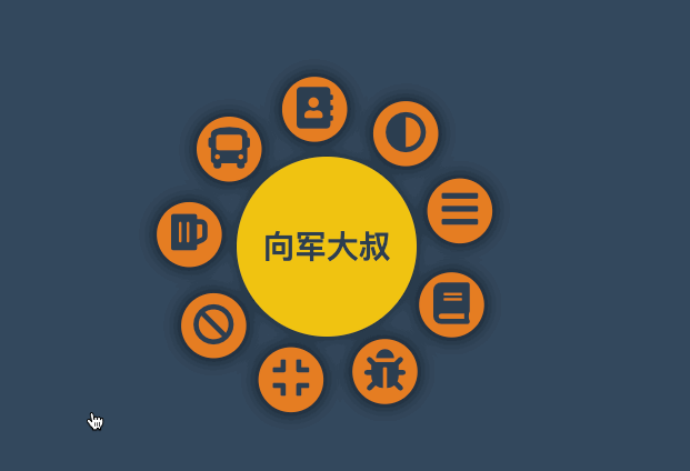
</main>动感菜单
为了让大家清楚理解,下面把思路给大家解析一下。
父级有宽度
设置父级 ul 有宽度,每层都是居中对齐。
<style>
* {
padding: 0;
margin: 0;
list-style: none;
}
body {
width: 100vw;
height: 100vh;
background: #2c3e50;
display: flex;
justify-content: center;
align-items: center;
}
nav {
width: 400px;
height: 400px;
background: transparent;
display: flex;
justify-content: center;
align-items: center;
position: relative;
}
nav::after {
content: '向军老师';
color: #ecf0f1;
position: absolute;
display: flex;
justify-content: center;
align-items: center;
font-size: 2em;
font-weight: bold;
text-shadow: 3px 3px 0px #34495e;
z-index: 1;
}
nav::before {
content: '';
width: 200px;
height: 200px;
background: #e74c3c;
border-radius: 50%;
position: absolute;
left: 50%;
top: 50%;
transform: translate(-50%, -50%);
z-index: 1;
}
nav:hover ul {
transform: scale(1);
}
ul {
width: 300px;
height: 300px;
transform: scale(0);
transition: .5s;
}
ul li {
width: 80px;
height: 80px;
background: #e74c3c;
border-radius: 50%;
position: absolute;
display: flex;
justify-content: center;
align-items: center;
font-size: 2.5em;
color: white;
transition: 1s;
transform-origin: 150px 150px;
box-shadow: 0 0 15px rgba(0, 0, 0.8);
}
ul li span {
transition: 1s;
}
nav:hover li:nth-child(1) {
transform: rotate(40deg);
}
nav:hover li:nth-child(1)>span {
transform: rotate(1040deg);
}
nav:hover li:nth-child(2) {
transform: rotate(80deg);
}
nav:hover li:nth-child(2)>span {
transform: rotate(1000deg);
}
nav:hover li:nth-child(3) {
transform: rotate(120deg);
}
nav:hover li:nth-child(3)>span {
transform: rotate(960deg);
}
nav:hover li:nth-child(4) {
transform: rotate(160deg);
}
nav:hover li:nth-child(4)>span {
transform: rotate(720deg);
}
nav:hover li:nth-child(5) {
transform: rotate(200deg);
}
nav:hover li:nth-child(5)>span {
transform: rotate(880deg);
}
nav:hover li:nth-child(6) {
transform: rotate(240deg);
}
nav:hover li:nth-child(6)>span {
transform: rotate(1680deg);
}
nav:hover li:nth-child(7) {
transform: rotate(280deg);
}
nav:hover li:nth-child(7)>span {
transform: rotate(1920deg);
}
nav:hover li:nth-child(8) {
transform: rotate(320deg);
}
nav:hover li:nth-child(8)>span {
transform: rotate(2200deg);
}
nav:hover li:nth-child(9) {
transform: rotate(360deg);
}
nav:hover li:nth-child(9)>span {
transform: rotate(2520deg);
}
</style>
<nav>
<ul>
<li><span><i class="fa fa-address-book" aria-hidden="true"></i></span></li>
<li><span><i class="fa fa-adjust" aria-hidden="true"></i></span></li>
<li><span><i class="fa fa-bars" aria-hidden="true"></i></span></li>
<li><span><i class="fa fa-book" aria-hidden="true"></i></span></li>
<li><span><i class="fa fa-bug" aria-hidden="true"></i></span></li>
<li><span><i class="fa fa-compress" aria-hidden="true"></i></span></li>
<li><span><i class="fa fa-ban" aria-hidden="true"></i></span></li>
<li><span><i class="fa fa-beer" aria-hidden="true"></i></span></li>
<li><span><i class="fa fa-bus" aria-hidden="true"></i></span></li>
</ul>
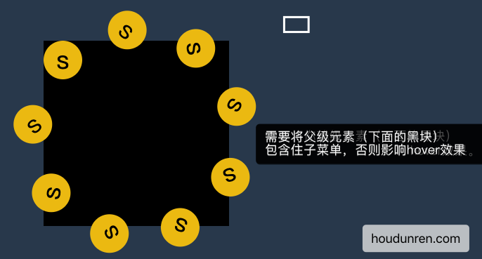
</nav>父级无宽度
下面代码父级 UL 没有设置宽度,而是使用边框撑开了空间的效果,基本原理和上面一样。
<style>
    * {
        padding: 0;
        margin: 0;
        box-sizing: border-box;
        list-style: none;
    }

    body {
        background: #34495e;
    }

    nav {
        position: absolute;
        margin: 0 auto;
        left: 50%;
        top: 50%;
        width: 180px;
        height: 180px;
        background: #34495e;
        border-radius: 50%;
        text-align: center;
        line-height: 180px;
        color: #2c3e50;
        font-weight: bold;
        font-size: 2em;
        background: #f1c40f;
        box-shadow: 0 0 15px rgba(0, 0, 0, .5);
        cursor: pointer;
        display: flex;
        justify-content: center;
        align-items: center;
    }

    nav strong {
        position: absolute;
    }

    nav:hover ul {
        transform: scale(1.3);
    }

    ul {
        transform: scale(0);
        border: 150px solid transparent;
        transition: .5s;
        cursor: pointer;
        z-index: -1;
    }

    ul li {
        position: absolute;
        top: -100px;
        left: -100px;
        width: 50px;
        height: 50px;
        background: #e67e22;
        border-radius: 50%;
        display: flex;
        justify-content: center;
        align-content: center;
        line-height: 1.5em;
        transition: all 1s;
        transform-origin: 100px 100px;
        box-shadow: 0 0 15px rgba(0, 0, 0, .8);
    }

    ul li span {
        transition: all 1s;
    }

    nav:hover ul li:nth-child(1) {
        transform: rotate(40deg);
    }

    nav:hover ul li:nth-child(1) span {
        transform: rotate(1040deg);
    }

    nav:hover ul li:nth-child(2) {
        transform: rotate(80deg);
    }

    nav:hover ul li:nth-child(2) span {
        transform: rotate(1000deg);
    }

    nav:hover ul li:nth-child(3) {
        transform: rotate(120deg);
    }

    nav:hover ul li:nth-child(3) span {
        transform: rotate(1680deg);
    }

    nav:hover ul li:nth-child(4) {
        transform: rotate(160deg);
    }

    nav:hover ul li:nth-child(4) span {
        transform: rotate(560deg);
    }

    nav:hover ul li:nth-child(5) {
        transform: rotate(200deg);
    }

    nav:hover ul li:nth-child(5) span {
        transform: rotate(520deg);
    }

    nav:hover ul li:nth-child(6) {
        transform: rotate(240deg);
    }

    nav:hover ul li:nth-child(6) span {
        transform: rotate(480deg);
    }

    nav:hover ul li:nth-child(7) {
        transform: rotate(280deg);
    }

    nav:hover ul li:nth-child(7) span {
        transform: rotate(440deg);
    }

    nav:hover ul li:nth-child(8) {
        transform: rotate(320deg);
    }

    nav:hover ul li:nth-child(8) span {
        transform: rotate(400deg);
    }

    nav:hover ul li:nth-child(9) {
        transform: rotate(360deg);
    }

    nav:hover ul li:nth-child(9) span {
        transform: rotate(720deg);
    }
</style>


<nav>
    向军大叔
    <ul>
        <li><span><i class="fa fa-address-book" aria-hidden="true"></i></span></li>
        <li><span><i class="fa fa-adjust" aria-hidden="true"></i></span></li>
        <li><span><i class="fa fa-bars" aria-hidden="true"></i></span></li>
        <li><span><i class="fa fa-book" aria-hidden="true"></i></span></li>
        <li><span><i class="fa fa-bug" aria-hidden="true"></i></span></li>
        <li><span><i class="fa fa-compress" aria-hidden="true"></i></span></li>
        <li><span><i class="fa fa-ban" aria-hidden="true"></i></span></li>
        <li><span><i class="fa fa-beer" aria-hidden="true"></i></span></li>
        <li><span><i class="fa fa-bus" aria-hidden="true"></i></span></li>
    </ul>
</nav>
透视景深
perspective
- 使用
perspective来控制元素的透视景深 perspective规则为舞台元素控制景深,perspective属性为控制单个元素
舞台透视
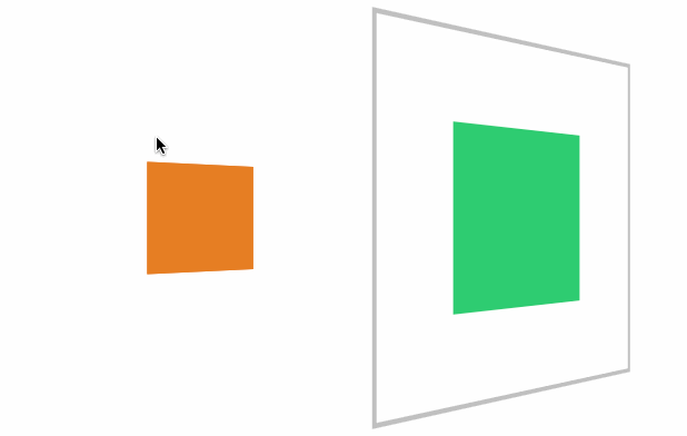
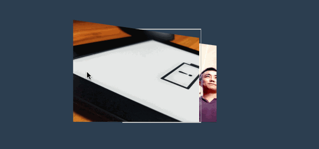
perspective 规则用于将父级整个做为透视元素,会造成里面的每个子元素的透视是不一样的。就像现实中摆一排杯子,是使用统一透视的,每个杯子的透视不一样,造成有大有小。
<style>
    article {
        margin: 0 auto;
        margin-top: 150px;
        width: 400px;
        height: 200px;
        position: relative;
        border: solid 5px silver;
        perspective: 200px;
    }

    article div {
        width: 100px;
        height: 100px;
        background: blueviolet;
        box-sizing: border-box;
        margin-right: 80px;
        float: left;
        transform: rotateY(60deg);
    }
</style>

<article>
	<div></div>
	<div></div>
</article>
单独透视
perspective 函数用于为元素设置单独透视,下面是为元素单独设置透视参数,每个元素的透视效果是一样的。
article div {
width: 100px;
height: 100px;
background: blueviolet;
box-sizing: border-box;
margin-right: 80px;
float: left;
transform: perspective(100px) rotateY(60deg);
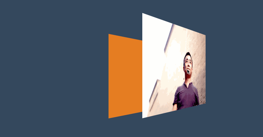
}3D 透视
transform-style
使用 transform-style 用于控制 3d 透视。
- 应用于舞台即变形元素的父级元素
- 设置
overflow:visible时preserve-3d才无效
| 选项 | 说明 |
|---|---|
| flat | 2D 平面舞台 |
| preserve-3d | 3D 透视舞台 |
效果体验
下面是设置3D舞台后看到的效果。
<style>
* {
padding: 0;
margin: 0;
box-sizing: border-box;
}
body {
background: #34495e;
}
main {
position: relative;
width: 100vw;
height: 100vh;
}
div {
position: absolute;
left: 50%;
top: 50%;
height: 200px;
width: 200px;
transition: 1s;
background: #e67e22;
transform-style: preserve-3d;
}
div img {
height: 80%;
transform: perspective(500px) translateZ(100px);
}
div:hover {
transform: perspective(600px) rotateY(50deg);
}
</style>
<main>
<div>
<img src="5.jpg" alt="">
</div>
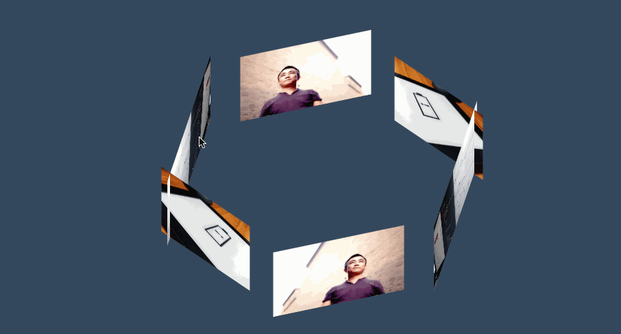
</main>三维图集
<style>
    body {
        background: #34495e;
    }

    main {
        position: absolute;
        width: 400px;
        height: 200px;
        left: 50%;
        top: 50%;
        transform-style: preserve-3d;
        transform-origin: center center -300px;
        transform: translate(-50%, -50%) rotateX(-45deg);
        transition: 2s;
    }

    body:hover main {
        transform: translate(-50%, -50%) rotateX(-45deg) rotateY(900deg);
    }

    div {
        position: absolute;
        width: 100%;
        height: 100%;
        transform-origin: center center -300px;
        overflow: hidden;
    }

    div img {
        height: 100%;
    }

    div:nth-child(1) {
        transform: rotateY(60deg);
    }

    div:nth-child(2) {
        transform: rotateY(120deg);
    }

    div:nth-child(3) {
        transform: rotateY(180deg);
    }

    div:nth-child(4) {
        transform: rotateY(240deg);
    }

    div:nth-child(5) {
        transform: rotateY(300deg);
    }

    div:nth-child(6) {
        transform: rotateY(360deg);
    }
</style>

<main>
    <div>
        <img src="5.jpg" alt="">
    </div>
    <div>
        <img src="1.jpg" alt="">
    </div>
    <div>
        <img src="3.jpg" alt="">
    </div>
    <div>
        <img src="5.jpg" alt="">
    </div>
    <div>
        <img src="1.jpg" alt="">
    </div>
    <div>
        <img src="3.jpg" alt="">
    </div>
</main>
观看视角
perspective-origin
perspective-origin用于控制视线的落点,就像我们眼睛看物体时的聚焦点。可以理解眼镜看物体的位置,比如看一台汽车,是在看车头左边看还是车头右边看。
需要设置 perspective 透视后才可以看到效果。
- 一般设置在舞台元素上来控制子元素
位置参数
| 取值 | 说明 |
|---|---|
| x-axis | 定义该视图在 x 轴上的位置。默认值:50%。可能的值:left、center、right、length、% |
| y-axis | 定义该视图在 y 轴上的位置。默认值:50%。可能的值:top、center、bottom、length、% |
效果体验
<style>
    body {
        background: #2c3e50;
        display: flex;
        width: 100vw;
        height: 100vh;
        justify-content: center;
        align-items: center;
    }

    main {
        border: solid 2px silver;
        width: 400px;
        height: 200px;
        transform-style: preserve-3d;
        transform: rotateY(65deg);
        perspective-origin: right bottom;
        perspective: 900px;
        transition: 2s;
    }

    body:hover main {
        perspective-origin: 1200% bottom;
        /* transform: rotateY(-65deg); */
    }

    div {
        position: absolute;
        width: 200px;
        height: 200px;
        transform: rotateY(60deg);
        overflow: hidden;
    }

    div>img {
        height: 100%;
    }

    div:nth-child(1) {
        background: #e67e22;
    }

    div:nth-child(2) {
        background: #27ae60;
        transform: rotateY(60deg) translateZ(-200px);
    }
</style>
<main>
    <div><img src="3.jpg" alt=""></div>
    <div><img src="5.jpg" alt=""></div>
</main>
立方体
效果如下
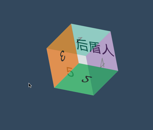
<style>
    * {
        padding: 0;
        margin: 0;
        box-sizing: border-box;
        list-style: none;
    }

    body {
        background: #34495e;
    }

    main {
        position: absolute;
        left: 50%;
        top: 50%;
        width: 200px;
        height: 200px;
        transform-style: preserve-3d;
        transform-origin: 50% 50% 50px;
        transform: translate(-50%, -50%) rotateY(0deg);
        transition: 2s;
    }

    main:hover {
        transform: translate(-50%, -50%) rotate3d(1, 1, 0, 180deg);
    }

    div {
        position: absolute;
        width: 200px;
        height: 200px;
        background: #000;
        display: flex;
        justify-content: center;
        align-items: center;
        font-size: 4em;
    }

    div:nth-child(1) {
        transform-origin: right;
        background: #1abc9c;
        transform-origin: bottom;
        transform: translateY(-200px) rotateX(-90deg);
        opacity: .8;
    }

    div:nth-child(2) {
        transform-origin: right;
        background: #27ae60;
        transform-origin: top;
        transform: translateY(200px) rotateX(90deg);
        opacity: .8;
    }

    div:nth-child(3) {
        transform-origin: bottom;
        background: #e67e22;
        transform-origin: right;
        transform: translateX(-200px) rotateY(90deg);
        opacity: .8;
    }

    div:nth-child(4) {
        transform-origin: top;
        background: #8e44ad;
        transform-origin: left;
        transform: translateX(200px) rotateY(-90deg);
        opacity: .8;
    }

    div:nth-child(5) {
        transform-origin: left bottom;
        background: #ecf0f1;
        opacity: .8;
    }

    div:nth-child(6) {
        transform-origin: left bottom;
        background: #ecf0f1;
        opacity: .5;
        transform: translateZ(200px);
    }
</style>

<main>
    <div>1</div>
    <div>2</div>
    <div>3</div>
    <div>4</div>
    <div>5</div>
    <div>后盾人</div>
</main>
隐藏背面
backface-visibility
使用 backface-visibility 用于控制是否可以看到元素的背面。
- 一般设置在元素上而不是舞台元素上
- 需要舞台元素(父级元素)设置
transform-style: preserve-3d
| 选项 | 说明 |
|---|---|
| visible | 背面可见 |
| hidden | 背面隐藏 |
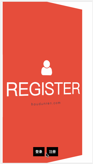
翻转卡片
下面使用隐藏背面与透视技术制作的翻转卡片效果。
<script src='https://code.jquery.com/jquery-3.3.1.slim.min.js'></script>
<link rel="stylesheet" href="https://maxcdn.bootstrapcdn.com/font-awesome/4.7.0/css/font-awesome.min.css">
<style>
    * {
        padding: 0;
        margin: 0;
        box-sizing: border-box;
    }

    main {
        position: absolute;
        width: 100vw;
        height: 100vh;
        transition: 2s;
        transform-style: preserve-3d;
    }

    main.login {
        transform: perspective(900px) rotateY(0deg);
    }

    main.register {
        transform: perspective(900px) rotateY(180deg);
    }

    div {
        position: absolute;
        width: 100%;
        height: 100%;
        font-size: 5em;
        display: flex;
        flex-direction: column;
        justify-content: center;
        align-items: center;
        backface-visibility: hidden;
        transition: 2s;
        text-transform: uppercase;
        color: white;
    }

    div span {
        text-transform: lowercase;
        letter-spacing: .2em;
        font-size: .2em;
        color: #2c3e50;
    }

    div:nth-child(1) {
        background: #2ecc71;
        transform: rotateY(0deg);
    }

    div:nth-child(2) {
        background: #e74c3c;
        transform: rotateY(180deg);
    }

    nav {
        position: absolute;
        width: 100%;
        height: 100%;
        z-index: 99;
        text-align: center;
        display: flex;
        align-items: flex-end;
        justify-content: center;
        padding-bottom: 30px;
    }

    nav a {
        padding: 10px;
        text-decoration: none;
        font-size: 1em;
        background: #000;
        color: white;
        margin-right: 10px;
        cursor: pointer;
        left: 0;
        top: 0;
    }
</style>

<main>
    <div>
        <i class="fa fa-home" aria-hidden="true"></i>
        login
        <span>houdunren.com</span>
    </div>
    <div>
        <i class="fa fa-user" aria-hidden="true"></i>
        register
        <span>houdunren.com</span>
    </div>
</main>
<nav>
    <a href="javascript:;" onclick="change('login')">登录</a>
    <a href="javascript:;" onclick="change('register')">注册</a>
</nav>
<script>
    function change(t) {
        switch (t) {
            case 'login':
                $("main").removeClass().addClass('login');
                break;
            case 'register':
                $("main").removeClass().addClass('register');
                break;
        }
    }
</script>
常见问题
如果发现元素不能点击,可能是父级设置了 transform-style: preserve-3d 属性,且同级元素设置了 3D 变化特性,造成对点击元素有遮挡。有以下两种方式解决
- 对变形元素设置
pointer-events: none;使用其不接受点击事件 - 删除父级的
transform-style: preserve-3d属性