Appearance
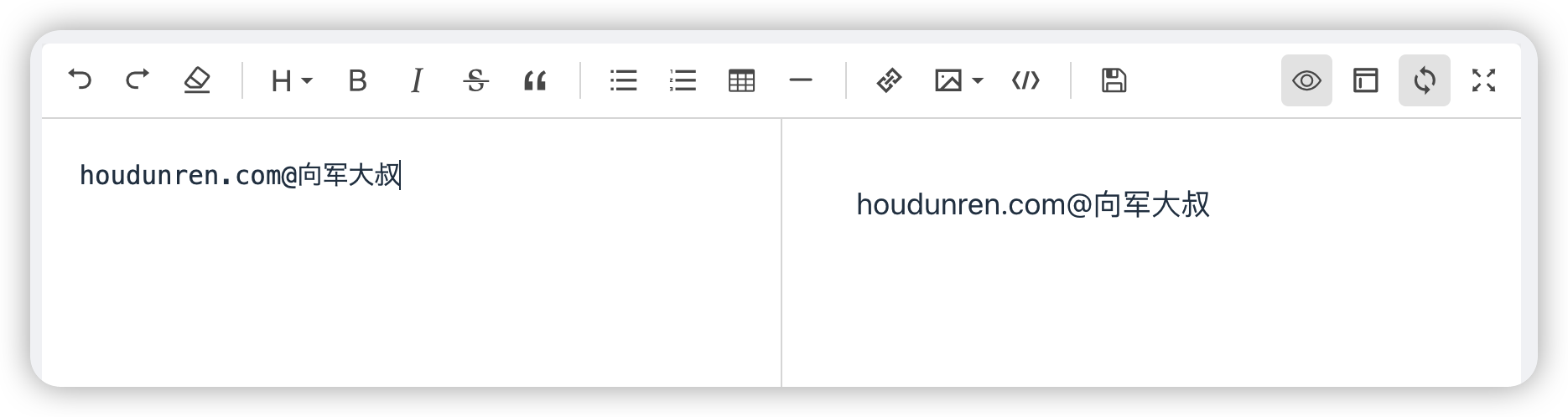
Markdown

src/components/hd/markdown 组件是用于渲染 markdown 编辑器
props 选项说明
| props | 说明 |
|---|---|
| v-model | 编辑器数据 |
使用示例
<script setup lang="ts">
const text = ref('')
</script>
<template>
<HdMarkdown v-model="text" />
<div class="p-3 border bg-gray-100">
{{ text }}
</div>
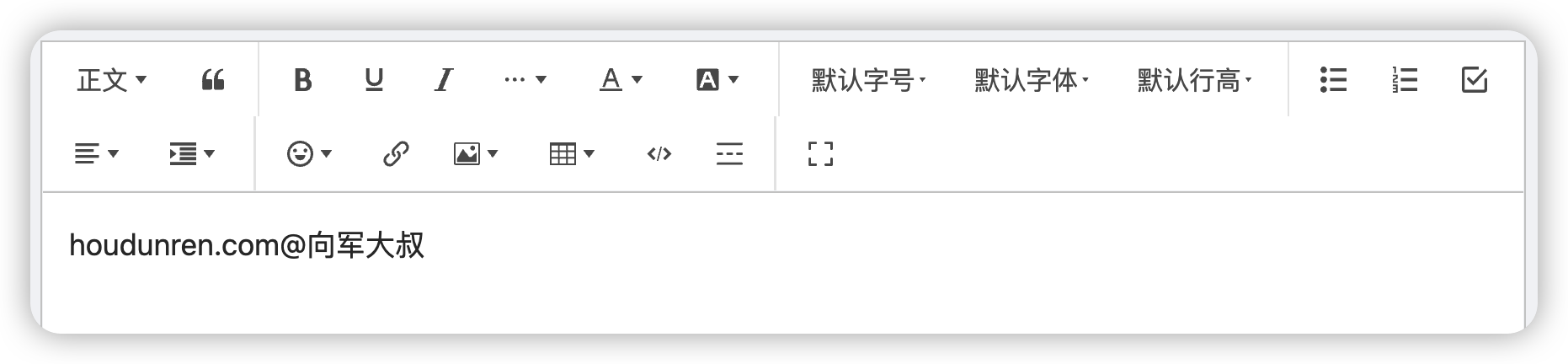
</template>富文本编辑器
src/components/hd/wangEditor 组件用于渲染富文件编辑器,内部是使用wangeditor 构建的
props 说明
| props | 说明 |
|---|---|
| v-model | 响应数据 |
| height | 编辑器高度 |
使用示例
<script setup lang="ts">
import { ref } from 'vue'
const content = ref('后盾人')
</script>
<template>
<div class>
<EditorWangEditor v-model="content" :height="300" />
<div class="bg-gray-100 mt-3 border p-3">{{ content }}</div>
</div>
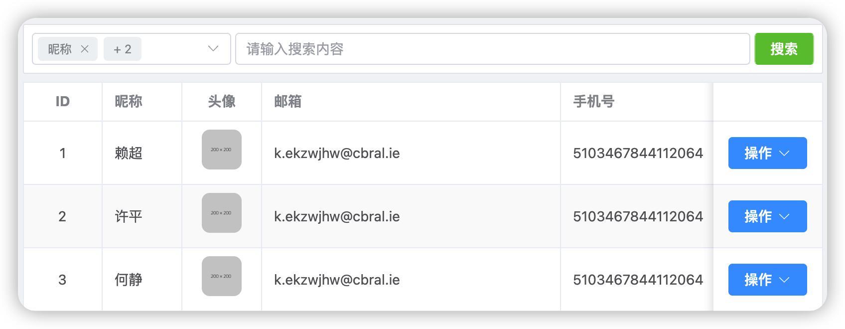
</template>表格渲染
src/components/hd/tableRender 组件可以快速渲染出表格
props
下面对 props 进行说明
| prop | 说明 |
|---|---|
| data | 渲染数据,后端接口返回的数据 |
| columns | 列说明 |
| button-type | 按钮类型 |
| buttons | 按钮数据 |
data
后端接口数据 apis/user.ts
- 一般统一定义在 apis 目录中
import { http } from '@/plugins/axios'

export async function userList() {
  return await http.request<UserModel, ResponsePageResult<UserModel>>({ url: `user` })
}
columns
用于对表格列进行定义,类型声明如下
- 一般统一定义在 **config/table.ts ** 文件中
interface TableColumnsType {
  prop: string //字段英文名
  label: string	//中文标题
  width?: number	//宽度
  align?: 'left' | 'center' | 'right'	//对方方式
  type?: 'image' | 'date' | 'input' | 'radio' | 'tag' //列类型
  options: { label: string; value: any }[] //type为radio时,显示内容定义
  search?: boolean //是否用于搜索
  fixed?: boolean //列是否fixed,与 elementUi 含义相同
  tag_field?: string	//type为tag时的显示内容
}
使用示例
表格的columns列定义 config/table.ts
export const userTableColumns = [
  { prop: 'id', label: 'ID', align: 'center', width: 80 },
  { prop: 'nickname', label: '昵称', search: true },
  { prop: 'avatar', label: '头像', type: 'image', align: 'center', width: 80 },
  { prop: 'email', label: '邮箱', width: 300, search: true },
  { prop: 'mobile', label: '手机号', width: 200, search: true },
  {
    prop: 'sex',
    label: '性别',
    align: 'center',
    type: 'radio',
    options: [
      { label: '男', value: 1 },
      { label: '女', value: 2 },
    ],
    tag_field: 'ee',
    width: 80,
  },
  { prop: 'created_at', label: '注册时间', type: 'date', width: 120 },
  { prop: 'updated_at', label: '更新时间', type: 'date', width: 120 },
] as TableColumnsType[]
页面中使用组件
<script setup lang="ts">
import { userList } from '@/apis/user'
import { userTableColumns } from '@/config/table'

const result = await userList()
</script>

<template>
  <HdTableRender
    :data="result.data.splice(0, 10)"
    :columns="userTableColumns"
    :button-type="'default'"
    :buttons="[
      { title: '查看', type: 'success' },
      { title: '删除', type: 'danger' },
    ]" />
</template>
表单渲染
src/components/hd/formRender 组件可以快速渲染前端表单,加快开发速度

props
| prop | 说明 |
|---|---|
| fields | 表单项声明 |
| model | 响应数据 |
fields 用于对表单的类型进行声明,一般建议统一定义到 src/config/form.ts 文件中
下面是类型声明文件
interface FormFieldType {
  //中文描述
  title: string
  //字段名
  name: string
  //后端返回的表单验证错误的字段名,默认值与name相同
  error_name?: string
  // 表单类型
  type?: 'input' | 'textarea' | 'image' | 'preview' | 'radio' | 'wangeditor' | 'markdown'
  //类型为rado时的选项
  options?: { label: string; value: any }[]
  //html的readonly
  readonly?: boolean
  //html的disabled
  disabled?: boolean
  //html的placeholder
  placeholder?: string
  //默认值
  value?: any
}
使用示例
columns 定义 config/form.ts
export const userForm = [
  { title: '昵称', name: 'nickname' },
  { title: '邮箱', name: 'email' },
  {
    title: '性别',
    name: 'sex',
    type: 'radio',
    options: [
      ['男', 1],
      ['女', 2],
    ],
  },
  { title: '手机号', name: 'mobile' },
  { title: '头像', name: 'avatar', type: 'preview' },
  { title: '主页', name: 'home' },
] as FormFieldType[]
页面中使用渲染组件
<script setup lang="ts">
import { userForm } from '@/config/form'
import userStore from '@/store/userStore'

const store = userStore()
const user = ref(store.info)
</script>

<template>
  <el-card shadow="always" :body-style="{ padding: '20px' }">
    <template #header> 用户资料 </template>
    <HdFormRender :fields="userForm" :model="user" />
  </el-card>
</template>
动画列表
src/components/hd/animateList 以动画的形式渲染列表
props 参数说明
| prop | 说明 |
|---|---|
| duration | 过渡时间 |
| delay | 延迟时间 |
| tag | 包裹标签 |
示例代码如下
<script setup lang="ts"></script>

<template>
  <HdAnimateList tag="ul" :duration="2" :delay="0.1">
    <li v-for="(num, index) of 10" :data-index="index">
      {{ num }}
    </li>
  </HdAnimateList>
</template>

<style lang="scss" scoped>
ul {
  li {
    @apply bg-purple-600 text-white p-2 mb-2;
  }
}
</style>
全屏组件
src/components/hd/fullscreen 组件可以控制页面全屏切换
<HdFullscreen class="hidden md:flex mr-3 text-gray-600" />渲染面包屑
src/components/hd/breadcrumb 用于渲染面包屑
- 组件根据路由自动识别渲染

示例代码
<HdBreadcrumb/>验证错误
src/components/hd/error 组件用于显示后端的表单验证错误消息,具体执行流程
apis/xxx.ts 请求后台 > plugins/axios/Axios.ts 根据422状态码拦截错误消息 -> 将错误消息保存到 store/errorStore.ts 全局响应 -> HdError 组件从errorStore中获取消息展示。
- 如果你的后端状态码不是422,请自行修改plugins/axios/Axios.ts文件中的逻辑